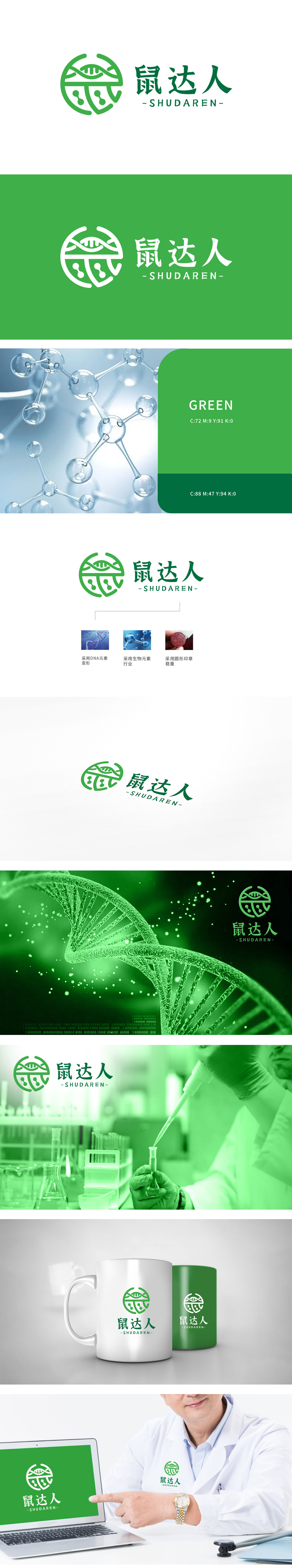
狮动设计采用了Logo左侧的图形融合了DNA双螺旋结构的元素,突显公司在生物科技或健康领域的专业背景。整体图形呈圆形,类似传统印章的设计,传达出稳重、可靠的品牌形象。Logo将现代生物科技的象征(DNA、分子)与传统印章的稳重感相结合,展现出公司在科技与传统领域的双重优势。狮动设计,不仅关注视觉美感,更注重品牌内涵的深度表达。选择狮动,让您的品牌在激烈的市场竞争中脱颖而出,吸引更多目标客户的关注与信赖。
The Lion Movement team conducted in-depth research on the industry trends and brand concepts, with vibrant orange as the main color, created an embarrassing cartoon bear image, and held a spoon to convey the pleasure of dining. Innovative use of "auspicious | food | bear" separate design, with pinyin to strengthen recognition. Simple and bright visual language fits the light food track accurately, and customers are full of praise for the design ability of Lion Motion's "strategy+creativity" dual drive, calling "this is the soul of our new brand"!


扫码或拨打添加客服微信


