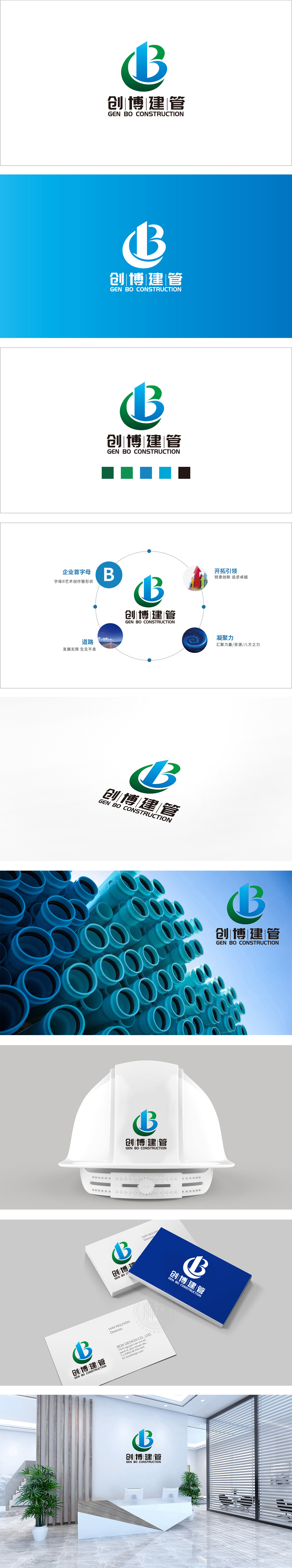
狮动设计采用「C+B」的组合变形,蓝色部分:像一栋直立的「高楼」,直接点出「建管」的核心业务,线条方正有力,传递「专业、可靠」的信任感;绿色部分:是环绕高楼的「曲线圆环」,既像「纽带」(连接客户、项目、团队),又像「生态环」(呼应「绿色建筑」「可持续发展」的现代建筑趋势),同时也强化了「C」(创)的符号感。整体既「有活力」又「不飘」,符合「建管」企业「稳扎稳打」的形象。
Lion Design adopts the combination of "C+B", and the blue part: like an upright "tall building", it directly points out the core business of "pipe construction", with strong lines and conveys the trust of "professionalism and reliability"; Green part: it is a "curved ring" around high-rise buildings, which is not only like a "link" (connecting customers, projects and teams), but also like an "ecological ring" (echoing the modern architectural trend of "green building" and "sustainable development"), and it also strengthens the symbolic sense of "C".


扫码或拨打添加客服微信

