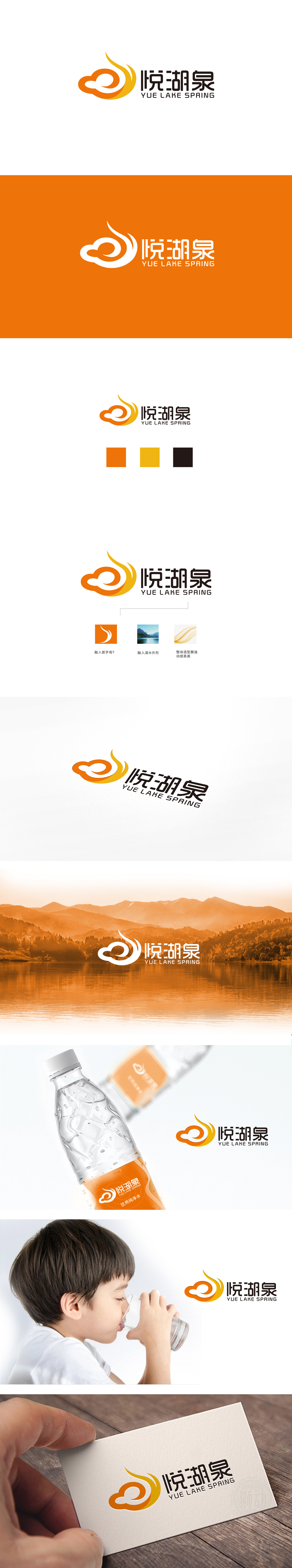
狮动设计采用抽象的曲线,像湖水泛起的涟漪(呼应“湖”),像泉水喷涌的动态(紧扣“泉”),更像抽象的“悦”字或绽开的笑脸,传递了自然感,又带出了喝矿泉水的愉悦体验。橙黄渐变的颜色从中心向边缘扩散,像阳光透过湖水的光斑,又像泉水流动的轨迹,给静态的图形注入了“活”的感觉,完美模拟了“泉”的流动感,让人一眼就能联想到清澈的泉水从湖中涌出的画面。线条的涟漪、泉水元素,颜色的阳光、湖水感觉,都在告诉消费者:“我们的水来自自然的湖泉”,完美传递了矿泉水“纯净、健康”的核心卖点。
Lion design adopts abstract curves, like ripples in the lake (echoing "lake"), like the dynamics of spring water gushing (closely following "spring"), more like the abstract word "Yue" or a smiling face, which conveys a sense of nature and brings out a pleasant experience of drinking mineral water. The gradual color of orange and yellow spreads from the center to the edge, like the light spot of sunlight passing through the lake, and like the trajectory of spring water flowing, which injects a sense of "living" into static graphics and perfectly simulates the flowing sense of "spring", which makes people think of the picture of clear spring water pouring out of the lake at a glance. The ripples of lines, the elements of spring water.


扫码或拨打添加客服微信

