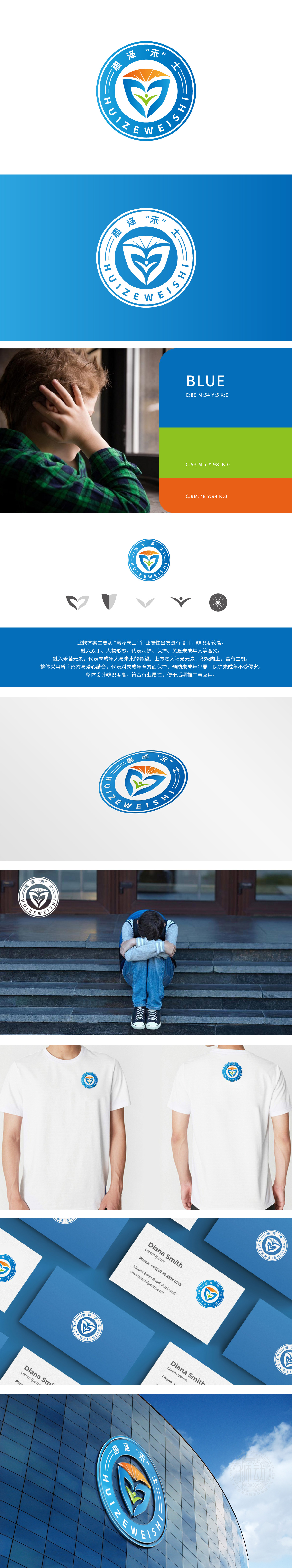
狮动设计融入双手与人物形态:象征着呵护、保护与关爱,传递公司对青少年的全面关怀。禾苗元素:代表青少年如同禾苗般充满希望与未来,寓意成长与茁壮。阳光元素:位于Logo上方,象征积极向上、充满生机,鼓励青少年健康快乐地成长,整体设计融合了青少年保护与关爱的理念,是狮动在图形设计领域的又一力作,值得新客户细细品味与欣赏。
Lion design is in the form of hands and characters: it symbolizes care, protection and care, and conveys the company's comprehensive care for teenagers. Element of rice seedling: It represents that young people are as full of hope and future as rice seedling, and implies growth and prosperity. Sunshine element: located above the Logo, it symbolizes positive and full of vitality, and encourages young people to grow up healthily and happily. The overall design integrates the concept of youth protection and care, and is another masterpiece of Lion Motion in the field of graphic design.


扫码或拨打添加客服微信


