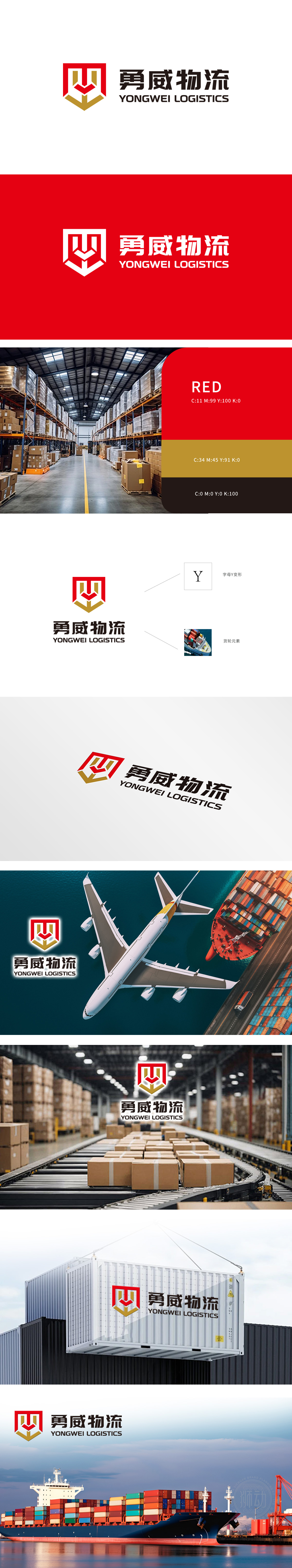
狮动设计采用了“Y”字母变形与货轮元素,象征公司物流业务的专业与高效。柔韧的曲线如货轮破浪前行,刚劲的棱角似集装箱堆叠的稳固,红色与金色的碰撞,既传递出行业的速度与活力,又彰显出“勇威”作为行业领航者的专业底蕴与信赖感。盾牌代表“安全、可靠、守护”,箭头则指向“精准抵达、使命必达”。狮动通过几何语言的碰撞,将抽象的服务承诺转化为具象的视觉力量,让勇威物流的品牌主张“不止运输,更守护每一份托付”落地生根。
Lion design adopts the "Y" letter deformation and freighter elements, symbolizing the professionalism and efficiency of the company's logistics business. The flexible curve is like a cargo ship breaking the waves, and the rigid edges and corners are like the stability of container stacking. The collision between red and gold not only conveys the speed and vitality of the industry, but also shows the professional background and trust of "Yongwei" as an industry leader. The shield stands for "safety, reliability and protection", and the arrow points to "accurate arrival and mission". Through the collision of geometric language.


扫码或拨打添加客服微信


