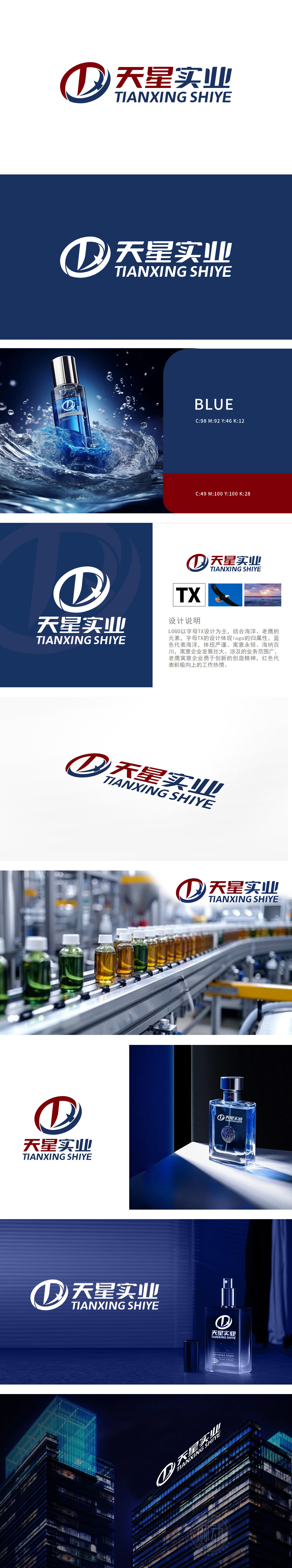
狮动以“字母TX+海洋元素+老鹰形象”为核心组合,抽象化老鹰展翅形象,线条锐利流畅,姿态昂扬,充满动态感,象征企业“勇于创新、锐意进取”的精神内核。蓝色(主色)代表严谨、专业与永恒,契合企业稳重可靠的行业形象;?红色(点缀色):注入活力与热情,平衡蓝色沉稳感,体现团队积极向上、开拓进取的态度。整体风格现代、简洁且富有张力。
Lion uses the letter TX+ ocean element+eagle image as the core combination, abstracting the image of the eagle spreading its wings, with sharp and smooth lines, high-spirited posture and dynamic sense, symbolizing the spiritual core of the enterprise's "courage to innovate and forge ahead". Blue (main color) represents preciseness, professionalism and eternity, which is in line with the stable and reliable industry image of the enterprise; Red (decorative color): inject vitality and enthusiasm, balance the sense of blue calmness.


扫码或拨打添加客服微信


