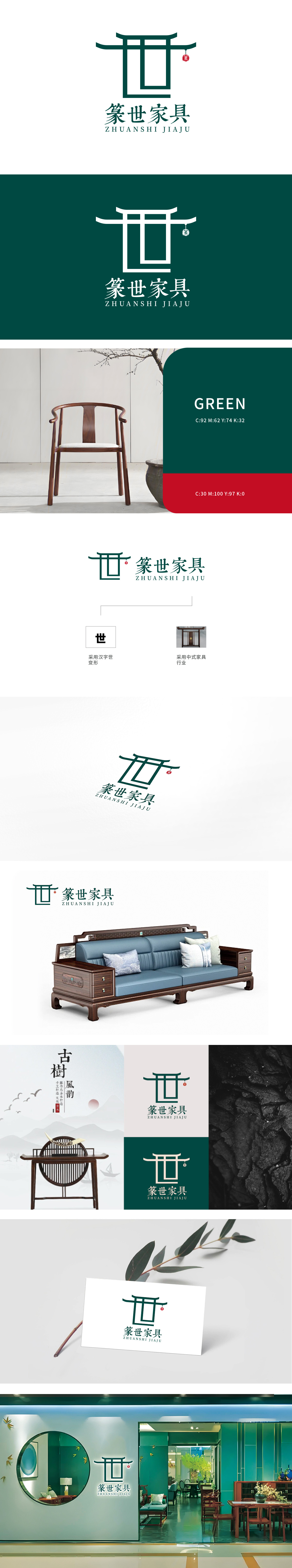
狮动以汉字“世”为原型,通过解构与重构,将笔画抽象为中式建筑的“梁架结构”上横舒展如屋檐挑角,中竖与左右竖线构成方正框架,形似传统家具的“方榫”或“棂格”,既保留“世”字的识别性,又暗合“世代传承”(世)与“家具结构之美”(形)的双重含义。线条采用硬朗的直线与对称布局,传递中式家具的“工法严谨”与“方正沉稳”,墨绿色主色调沉稳大气,呼应传统实木家具的自然质感,亦象征品牌的“经典、可靠与生命力”世”:双关“世代传承”与“世间生活”,既传递品牌对传统工艺的坚守,也表达“为世间造好物”的愿景,与左侧“世”字图形形成文字-视觉的闭环。以形表意、以意传情”的设计巧思中式美学与品牌基因的融合。
Lion takes the Chinese character "Shi" as the prototype. Through deconstruction and reconstruction, the strokes are abstracted as the "beam structure" of Chinese architecture, which stretches horizontally like the corner of the roof, and the middle vertical line and the left and right vertical lines form a square frame, which is similar to the "square tenon" or "lattice" of traditional furniture, which not only retains the recognition of the word "Shi", but also coincides with "inheritance from generation to generation" and "world" The lines adopt tough straight lines and symmetrical layout, conveying the "strict workmanship" and "square and steady" of Chinese furniture, and the dark green main color is calm and atmospheric.


扫码或拨打添加客服微信


