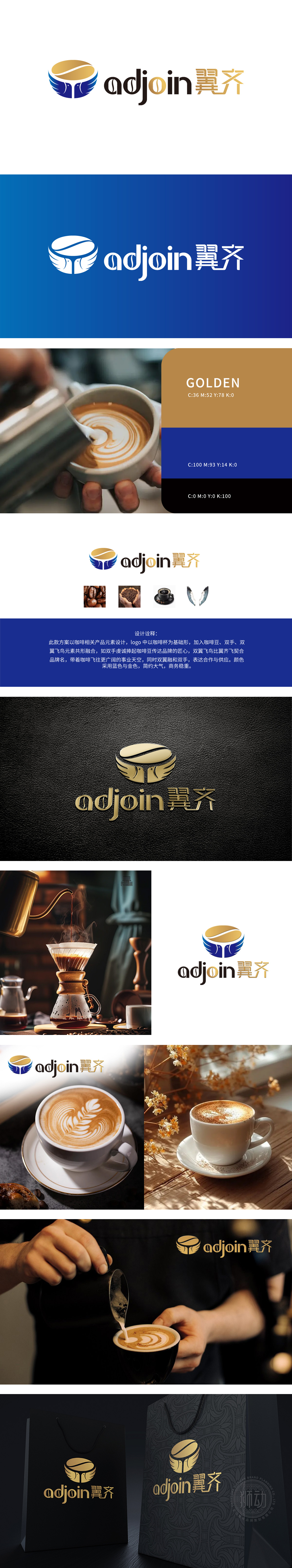
狮动以咖啡杯基底承载行业属性,咖啡豆象征产品本质,双手托举传递匠心温度,双翼飞鸟呼应“翼齐”之名——每一笔勾勒都是品牌战略的视觉化表达。蓝金色调碰撞,以商务稳重奠定信任感,用优雅质感提升品牌溢价,在理性与感性间找到完美平衡。翅膀与双手的共生形态,不仅是美学创新,更暗含“合作共赢”与“持续成长”的品牌承诺。咖啡杯与豆的交织,是对产品本质的敬畏;双手托举的姿态,是对品质的虔诚承诺;飞鸟双翼的舒展,是对未来无限可能的奔赴。
Lion with the coffee cup base bearing the industry attributes, coffee beans symbolize the essence of the product, hands lift to convey the ingenious temperature, and two-winged birds echo the name of "wing qi"-each sketch is a visual expression of brand strategy. The blue and gold tones collide, establishing trust with business stability, enhancing brand premium with elegant texture, and finding a perfect balance between rationality and sensibility. The symbiotic form of wings and hands is not only an aesthetic innovation, but also implies "win-win cooperation" and "sustainable growth" of brand promise.


扫码或拨打添加客服微信


