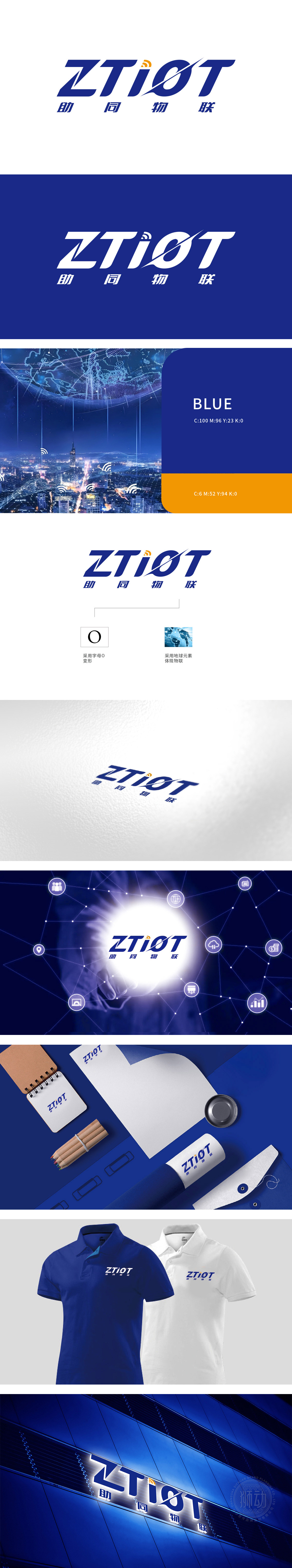
狮动以字母“O”进行了特殊变形设计,象征着连接和循环,契合物联网(IoT)中设备间互联互通的概念。Logo 右侧采用了地球的图案,蓝色的地球配以网络连接线条,直观地体现了物联网覆盖全球、连接万物的特性。Logo 中“i”字母上方添加了类似无线信号的标识,直接关联到无线通信技术,强调了公司在物联网领域中的通信技术核心。整体设计,既体现了公司的技术实力,又展现了其全球化的发展战略,成功传达了公司的业务核心和未来愿景。
Lion has a special deformation design with the letter "O", which symbolizes connection and circulation, and conforms to the concept of interconnection between devices in the Internet of Things (IoT). On the right side of the Logo, the pattern of the earth is adopted, and the blue earth is matched with network connection lines, which intuitively reflects the characteristics of the Internet of Things covering the whole world and connecting everything. A Logo similar to wireless signal is added above the letter "I" in LOGO, which is directly related to wireless communication technology, emphasizing the core of communication technology of the company in the field of Internet of Things.


扫码或拨打添加客服微信


