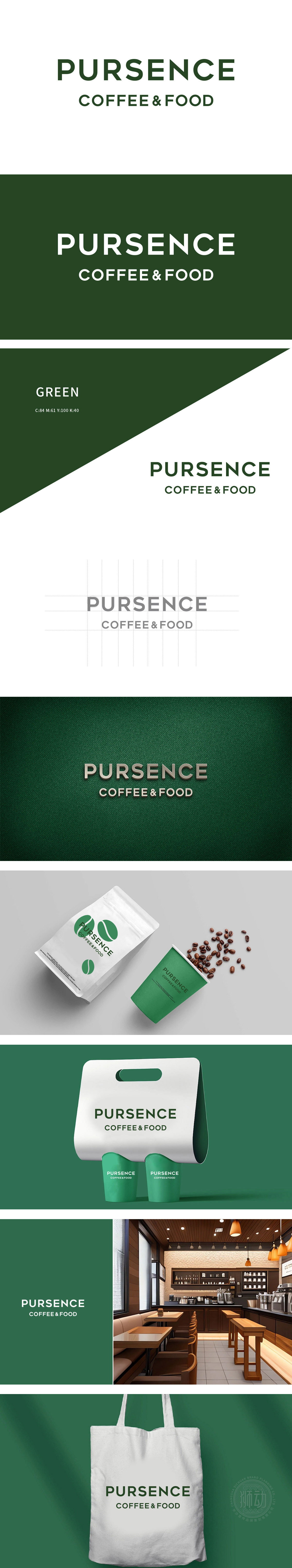
狮动以字母“P”的圆润转角似咖啡杯的温润把手,而“C”的流畅弧线则暗藏咖啡蒸汽升腾的灵动轨迹。深绿色调如咖啡豆沉静的色泽,形成味觉与视觉的双重碰撞。无衬线字体,简洁现代,易于阅读,适合品牌传播。深绿色象征自然、健康,与咖啡和食品的天然属性相契合,吸引注重品质的消费者。Logo采用简洁大方的无衬线字体,字体颜色为深绿色,传递出一种自然、稳重的品牌形象。
Lion with the rounded corner of the letter "P" like the warm handle of a coffee cup, while the smooth arc of "C" hides the clever trajectory of coffee steam rising. Dark green is like the quiet color of coffee beans, forming a double collision between taste and vision. Sans serif typeface, simple and modern, easy to read, suitable for brand communication. Dark green symbolizes nature and health, which is consistent with the natural attributes of coffee and food, and attracts consumers who pay attention to quality. Logo adopts simple


扫码或拨打添加客服微信


