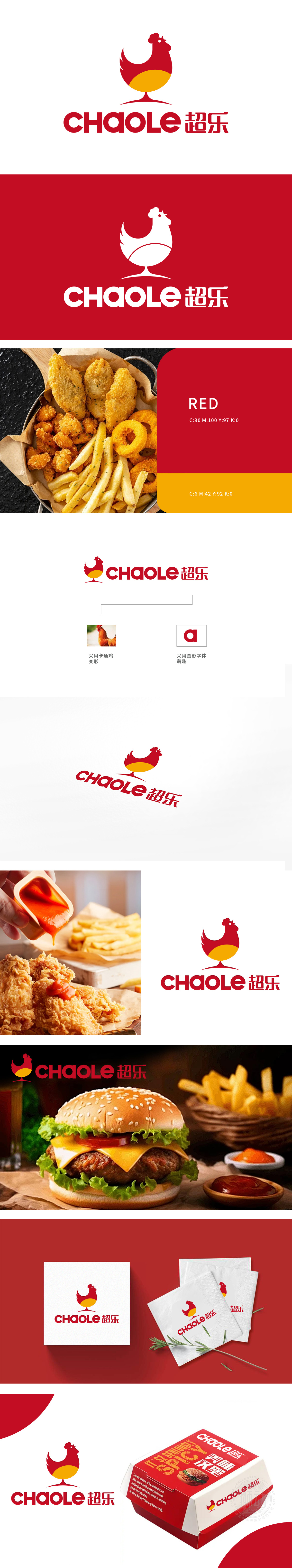
狮动采用真实公鸡为原型,通过简化线条与几何化处理,提炼出灵动可爱的卡通鸡造型。卡通鸡姿态生动,传递欢乐、活力的品牌内核,与品牌名「超乐」形成直观联想,红黄配色呼应炸鸡美食的温暖与食欲感,同时赋予品牌活力与亲和力,整体设计通过萌趣化的图形语言,引发消费者情感共鸣。精准捕捉行业特性与品牌调性,将“炸鸡”品类特征转化为独特的视觉符号;
Lion takes the real rooster as the prototype, and refines the smart and lovely cartoon chicken shape by simplifying lines and geometric processing. Cartoon chicken's vivid posture conveys the joy and vitality of the brand core, which is intuitively associated with the brand name "Chaole". The red and yellow color scheme echoes the warmth and appetite of fried chicken food, and at the same time endows the brand with vitality and affinity. The overall design arouses the emotional resonance of consumers through the cute graphic language.


扫码或拨打添加客服微信


