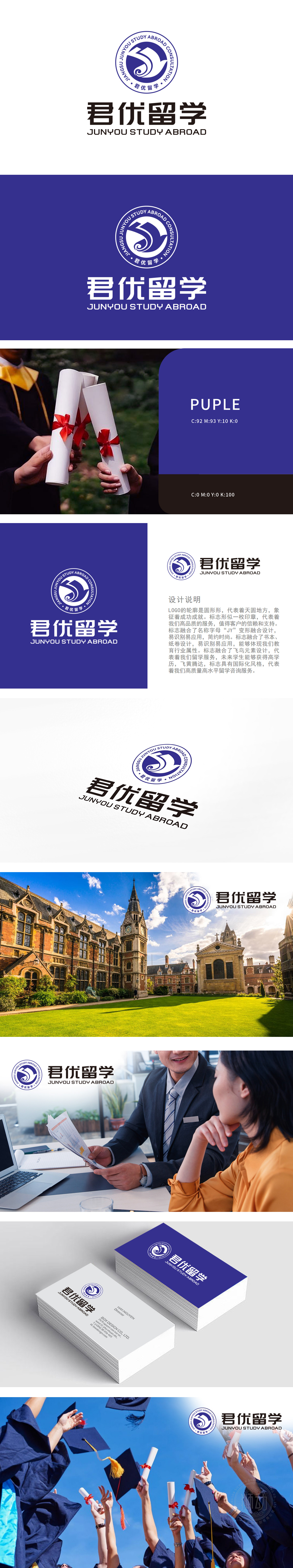
狮动将“JUNYOU”的首字母“JY”进行艺术化融合,形成流畅的线条组合。既强化品牌名称识别度,又通过抽象几何造型赋予现代时尚感,融入书本与卷轴形态,直接关联教育行业特性。线条的叠加与交错,象征知识的积累与传承,暗示君优留学作为教育桥梁的角色。巧妙嵌入飞鸟轮廓,呼应“留学服务”的核心业务。飞鸟象征学子突破地域限制、实现高学历与职业发展的愿景,印章形态:品质背书,信赖基石整体造型借鉴传统印章形态,传递权威感与承诺感。暗示君优留学以“高品质服务”为信条,如同盖章般给予客户坚实的信任保障。君优留学LOGO通过符号化的叙事语言,将品牌的核心价值、行业属性与情感承诺凝练于方寸之间,成为连接客户与品牌的无声代言人。
Lion artistically blends the initials "JY" of "JUNYOU" to form a smooth line combination. It not only strengthens the recognition of brand names, but also gives modern fashion sense through abstract geometric modeling, which is integrated into the form of books and scrolls and directly related to the characteristics of education industry. The overlapping and interlacing of lines symbolizes the accumulation and inheritance of knowledge and implies the role of Junyou studying abroad as an educational bridge. Ingeniously embedded in the outline of birds, echoing the core business of "study abroad service". The flying bird symbolizes students' vision of breaking through geographical restrictions and realizing high education and career development.


扫码或拨打添加客服微信


