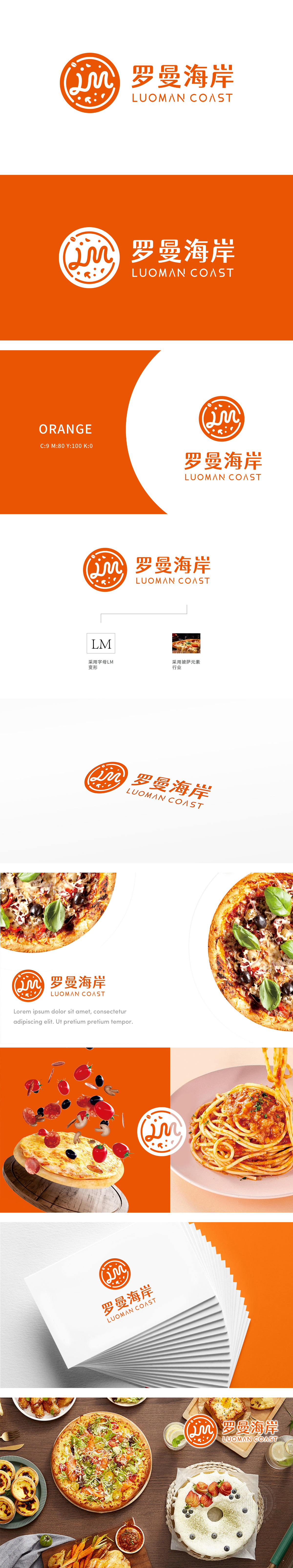
狮动设计采用了字母“LM”的变形设计,形成一个独特的视觉符号。直观展示了品牌所属的行业,设计创意十足。图形设计中融入了披萨的元素,如圆形的饼底和顶部的配料图案,直观地传达了品牌与披萨行业的关联,使消费者一眼就能联想到披萨美食。Logo采用了鲜艳的橙色,这种颜色通常给人以活力、热情和食欲的联想,整体设计通过创意的图形融合、鲜明的色彩选择和简洁的文字表达,成功地传达了品牌的独特性和行业属性。
Lion design adopts the deformation design of the letter "LM" to form a unique visual symbol. Intuitively shows the industry to which the brand belongs, and the design is full of creativity. The graphic design incorporates the elements of pizza, such as the circular bottom and top ingredients, which intuitively conveys the relationship between the brand and the pizza industry, so that consumers can associate pizza food at a glance. Logo uses bright orange, which usually gives people energy, enthusiasm and appetite. The overall design successfully conveys the uniqueness and industry attributes of the brand through creative graphic fusion, bright color selection and concise text expression.


扫码或拨打添加客服微信


