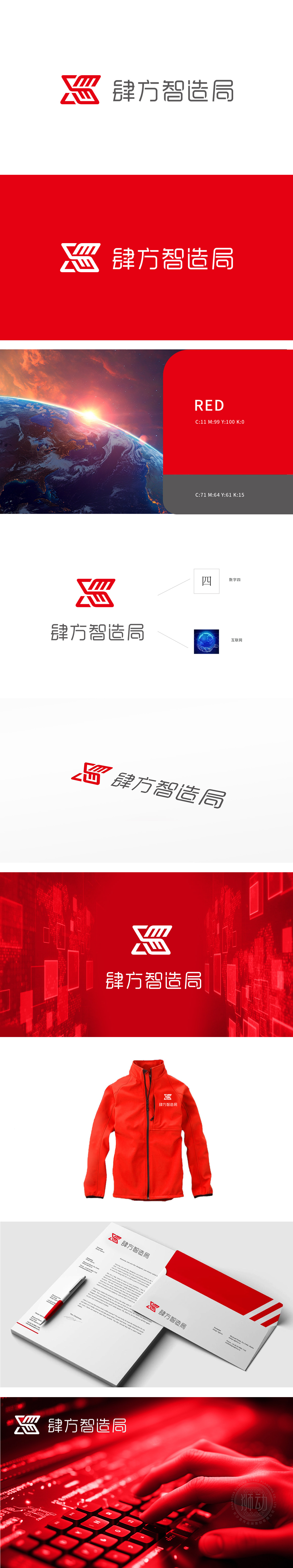
狮动设计将红色“S”形符号比喻为“数字脉搏”,赋予动态生命力;线条组合定义为“科技之力托起的全球互联想象”,直指互联网核心特质。创新视角重构科技与娱乐的边界,为肆方智造局打造的LOGO如同一幅跃动的未来图景——红色交织的“S”形符号如同数字脉搏的律动,不仅勾勒出“肆方”与“数字四”的深层关联,更以科技之力托起全球互联的想象空间。
Lion design compares the red "S" symbol to "digital pulse" and gives it dynamic vitality;Line combination is defined as "the global interconnected imagination supported by the power of science and technology", which directly refers to the core characteristics of the Internet. Reconstruct the boundary between technology and entertainment from an innovative perspective, and create a LOGO for Sifang Zhizao Bureau as a dynamic future picture-the red intertwined "S" symbol is like the rhythm of digital pulse.


扫码或拨打添加客服微信


