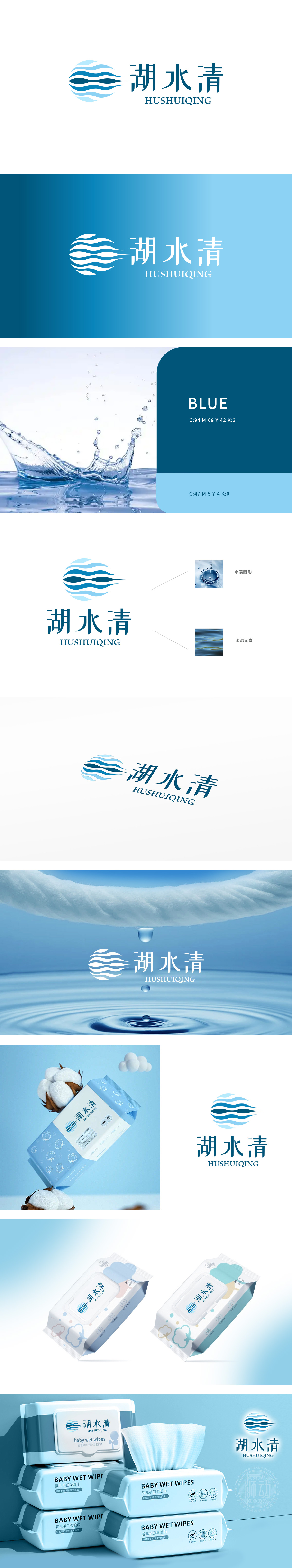
狮动设计将logo中的‘水端圆形’与‘水流元素’不仅是视觉符号,更巧妙呼应了柔湿巾的核心特质。‘水端圆形’描绘水滴落入水面形成的涟漪,其圆润形态与柔湿巾的柔软质感形成天然联想——圆形寓意温和、无棱角,传递出产品亲肤、细腻的触感。而‘水流元素’呈现的动态波纹,则生动演绎了柔湿巾的湿润特性与清洁功能,流动的线条象征水分均匀渗透,暗示产品使用时如水般温和且有效清洁的效果。设计将自然之韵与创新美学融合,打造出极具辨识度的视觉符号。
Lion design not only makes the' water end circle' and' water flow element' in logo visual symbols, but also subtly echoes the core characteristics of soft wipes. The' water-end circle' depicts the ripples formed by water drops falling into the water surface, and its rounded shape forms a natural association with the soft texture of soft wipes-the circle implies gentleness and no edges and corners, conveying the skin-friendly and delicate touch of the product. The dynamic ripple of' water flow element' vividly demonstrates the wetting characteristics and cleaning function of soft wipes, and the flowing lines symbolize the uniform penetration of water.


扫码或拨打添加客服微信


