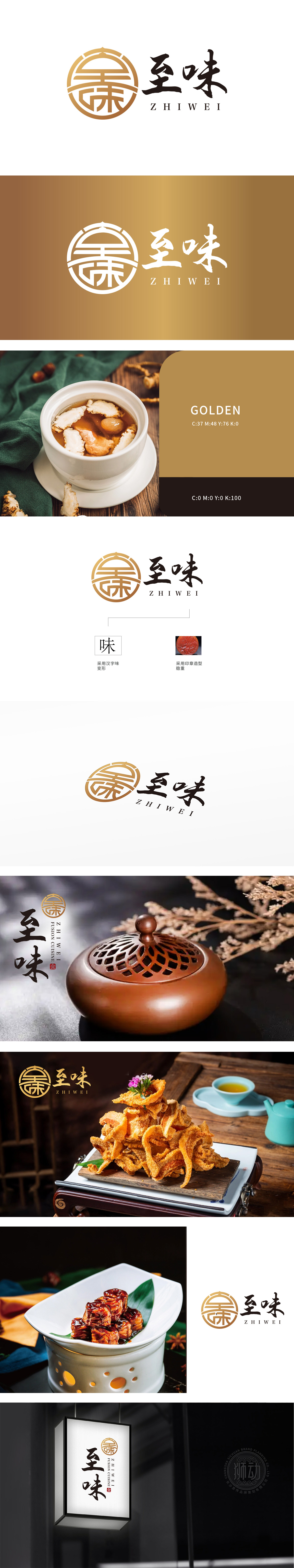
狮动采用金色圆形设计,餐厨特色,行业属性辨识度高 ,内部又融入汉字“味”的变形,浓厚的文化底蕴,蕴藏其中,整体以精妙的图形语言深度链接餐饮特质,从汉字‘味’的篆刻化变形到印章造型的稳重质感,每一笔勾勒都精准锚定餐饮品牌的核心诉求:既彰显传统美食底蕴,又传递出值得信赖的品质承诺。
Lion adopts the golden circular design, which has the characteristics of kitchen, high recognition of industry attributes, and incorporates the deformation of Chinese character "Wei" internally, which contains a strong cultural heritage. The overall catering characteristics are deeply linked with exquisite graphic language, from the seal cutting deformation of Chinese character "Wei" to the stable texture of seal modeling, and each sketch accurately anchors the core appeal of catering brands.


扫码或拨打添加客服微信


