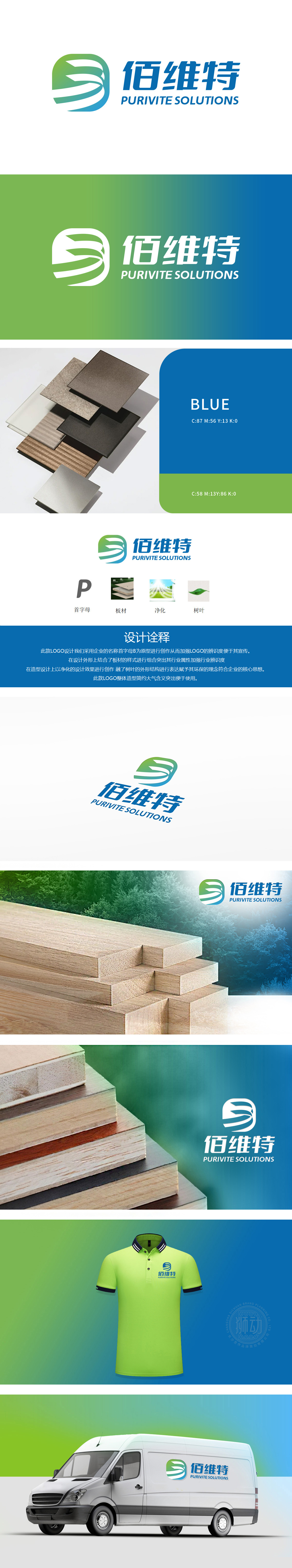
狮动设计以企业名称首字母“B”为原型,通过几何化重构形成视觉锚点,兼具现代感与辨识度。字母“B”的锐利线条与立体渐变处理,既形成强有力的“视觉锤”效应,又暗含建材行业所需的稳固、坚韧特质有机曲线与叶脉纹理的融入,为工业感强的建材行业注入自然生命力,直观传达环保、可持续发展的品牌价值观,平衡理性与感性认知。整体设计大胆融入层叠板材的抽象形态,通过线条交错与结构堆叠,直观传递企业主营业务的行业属性。板材元素的棱角处理与空间层次感,隐喻建材产品的精密工艺与结构性力量,同时以简约的图形语言规避冗杂,强化专业性与信赖感。
Lion design takes the initials "B" of the enterprise name as the prototype, and forms a visual anchor point through geometric reconstruction, which is both modern and recognizable. The sharp lines of the letter "B" and the three-dimensional gradient processing not only form a powerful "visual hammer" effect, but also imply the integration of the stable and tough organic curve and vein texture needed by the building materials industry, injecting natural vitality into the building materials industry with strong industrial sense, intuitively conveying the brand values of environmental protection and sustainable development, and balancing rationality and perceptual cognition.


扫码或拨打添加客服微信


