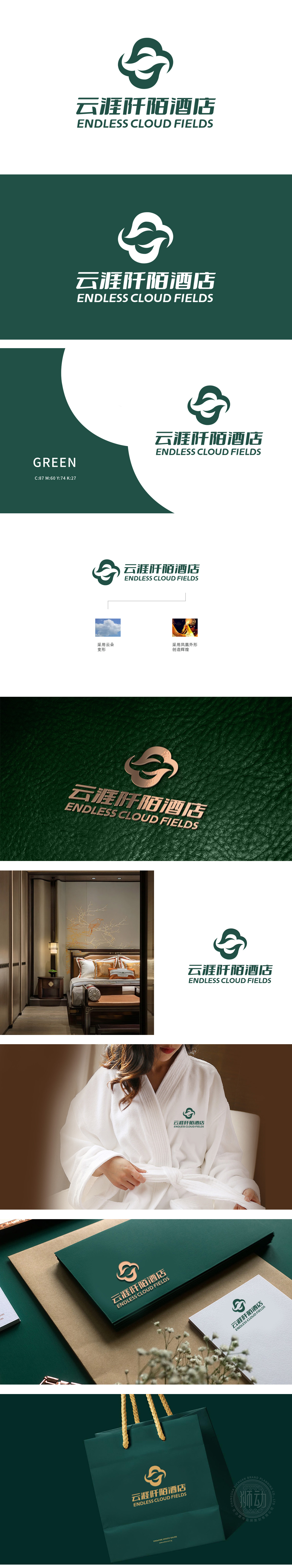
狮动设计以“云朵”为基底,将云朵的轮廓撕裂成锋利而流动的几何形态,仿佛云海被疾风劈开,暴露出蕴藏其中的磅礴能量。这种“变形”不是简单的艺术化处理,而是对自然力量的抽象化宣言——暗示酒店不仅是休憩之地,更是唤醒旅客内心野性的精神驿站。凤凰不再象征静态的祥瑞,而是化身破晓的使者,将“创造辉煌”的理念具象化为视觉上的穿透力——暗示酒店以炽热的服务、无与伦比的体验,照亮每一位旅客的旅程巅峰。以狮动设计以雷霆般的视觉张力撕开平庸的想象,将自然意象与东方神韵熔铸成一座跨越天际的视觉图腾。每一笔线条、每一抹色彩,皆是力量与诗意的交响,为酒店品牌注入直击灵魂的震撼力。
The core graphics of the lion design LOGO are based on "clouds", but they are by no means gentle descriptions. The designer uses a sharp-edged cutting technique to tear the outline of the cloud into a sharp and flowing geometry, as if the sea of clouds were split by a high wind, exposing the majestic energy contained in it. This "deformation" is not a simple artistic treatment, but an abstract declaration of natural forces-suggesting that the hotel is not only a place to rest, but also a spiritual post to awaken the inner wildness of tourists.Phoenix is no longer a symbol of static auspiciousness, but an emissary of dawn, which concretizes the concept of "creating brilliance" into visual penetration-suggesting that the hotel will illuminate the peak of every passenger's journey with its fiery service and unparalleled experience.


扫码或拨打添加客服微信


