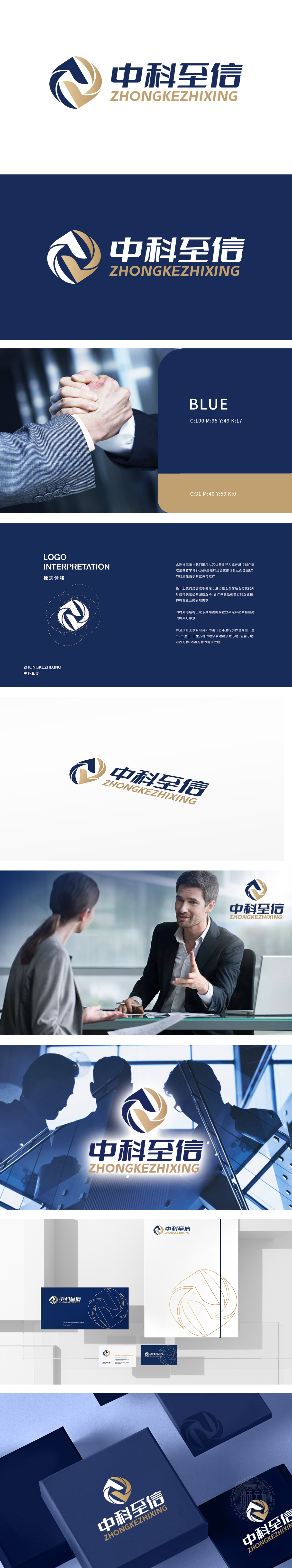
狮动设计以锐利的线条切割空间,重构“z”与k”的形态组合(源自“中科至信”品牌首字母),如同商业决策中精准破局的思维路径,形成动态张力;深蓝色主色调如深海般沉淀专业底蕴,米黄辅色则如智慧之光穿透表象,整体构型在静止中蕴含决策前行的势能,瞬间建立“专业咨询×创新突破”的心智联想。整体设计 通过字形解构、色彩心理学、字体工业感等维度,建立设计元素与商务信任、创新突破的语义桥梁;
Lion design cuts the space with sharp lines and reconstructs the combination of "Z" and "K" (from the initials of "Zhongke Zhixin" brand), just like the thinking path of precise breaking in business decision-making, forming dynamic tension; The main color of dark blue is like the deep sea, and the auxiliary color of beige is like the light of wisdom. The overall configuration contains the potential energy of decision-making in stillness, and the mental association of "professional consultation × innovation breakthrough" is established instantly. The overall design establishes a semantic bridge between design elements and business trust and innovation breakthrough through the dimensions of font deconstruction, color psychology and font industry sense.


扫码或拨打添加客服微信


