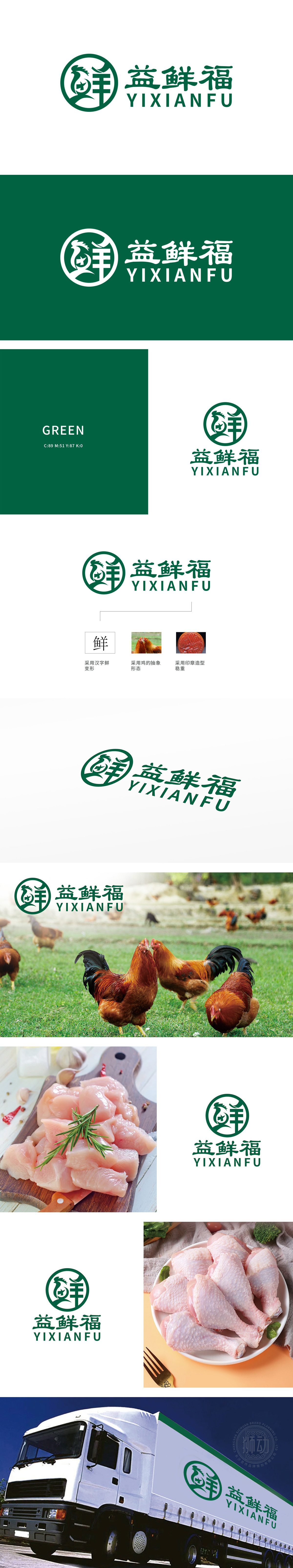
狮动设计以鱼羊共生之态重构“鲜”字内核。鱼跃的动态与羊角的张力交织,形成“鲜活流动”的视觉磁场,一笔一划皆在诉说食材从自然到餐桌的呼吸感,将“新鲜”从概念转化为可触摸的视觉脉搏。鸡的抽象图腾化:暗合阴阳平衡之道。更以抽象形态赋予品牌“吉祥”“活力”的灵性符号。鸡首的锐角设计如同破壳之力,象征品牌突破常规、唤醒消费活力的雄心。整体以“益鲜福”为核心,提炼三大基因密码——汉字“鲜”的哲学、鸡的吉祥图腾、印章的信任背书,构建品牌视觉DNA。
Lion design reconstructs the core of "fresh" with the symbiosis of fish and sheep. The dynamics of diving and the tension of the horn interweave to form a "fresh and flowing" visual magnetic field, which tells the breath of ingredients from nature to the table every stroke, and transforms "freshness" from concept to tangible visual pulse. The abstract totem of chicken: the way to balance yin and yang. It also gives the brand a spiritual symbol of "auspiciousness" and "vitality" in an abstract form. The acute angle design of the chicken head is like breaking the shell.


扫码或拨打添加客服微信


