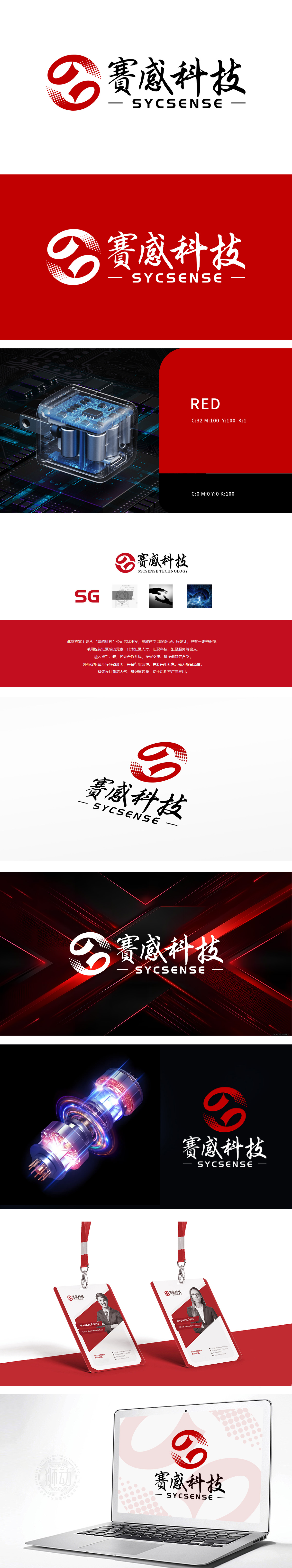
狮动设计将首字母“S”与“G”以动态交织的形态构成核心视觉符号,笔画锋利且极具张力,仿佛两条能量流相互牵引旋转,形成强烈的汇聚感与动态平衡。这种设计不仅直观提炼品牌名称,更通过几何线条的锐度与运动趋势,传递出“赛感科技”在行业中的先锋姿态与无限动能。整体色彩采用高饱和度红色作为基底,如同炽热能量场域,不仅醒目且充满激情,直接呼应科技领域的创新活力与品牌“热情共赢”的理念。
Lion Design forms the core visual symbol with the initials "S" and "G" in the form of dynamic interweaving. The strokes are sharp and extremely tense, as if the two energy streams are pulling and rotating each other, forming a strong sense of convergence and dynamic balance. This design not only intuitively refines the brand name, but also conveys the pioneering attitude and infinite kinetic energy of "Saigan Technology" in the industry through the sharpness and movement trend of geometric lines. The overall color adopts high saturation red as the base.


扫码或拨打添加客服微信


