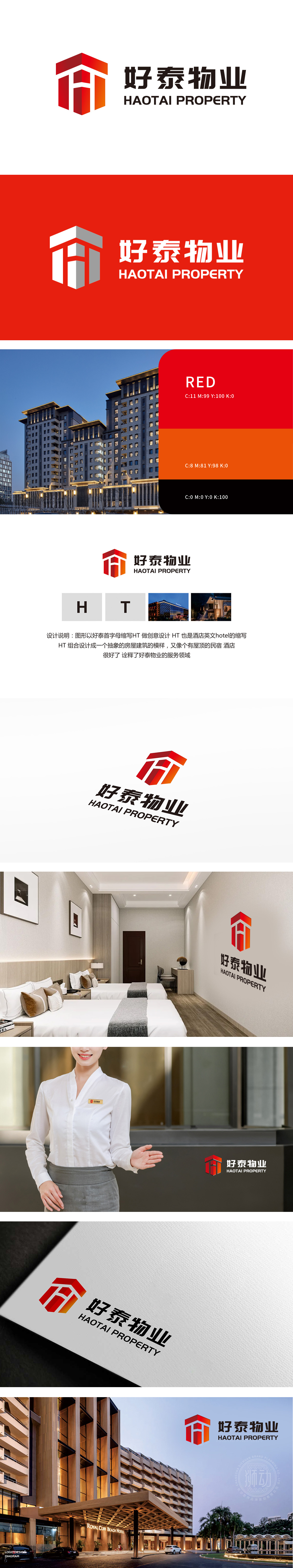
狮动设计以首字母「H」与「T」被彻底解构——「H」的挺拔垂直感化作建筑主体,「T」的横笔延伸成屋顶轮廓,一笔一划精准咬合,仿佛建筑钢筋般不可分割。这种“撕裂重组”的技法,让字母挣脱平面束缚,迸发出三维建筑的重量感与稳固感,一眼望去,如同物业守护的安心堡垒,直击客户对“专业”“信赖”的深层需求。炽红如朝阳,象征物业服务的热情与活力;暖橙似灯火,勾勒出“家”的温馨轮廓。“空间叠影”设计,让Logo成为品牌故事的“扩音器”——无需文字解释,视觉已传递一切。
Lion dance design is based on the fact that the initials "H" and "T" are completely deconstructed-the vertical sense of "H" becomes the main body of the building, and the horizontal pen of "T" extends into the outline of the roof, which is accurately meshed with each other as if it were a building steel bar. This technique of "tearing and reassembling" frees the letters from the plane, giving generate a sense of weight and stability of three-dimensional architecture. At first glance, it is like a fortress of peace of mind for property protection.


扫码或拨打添加客服微信


