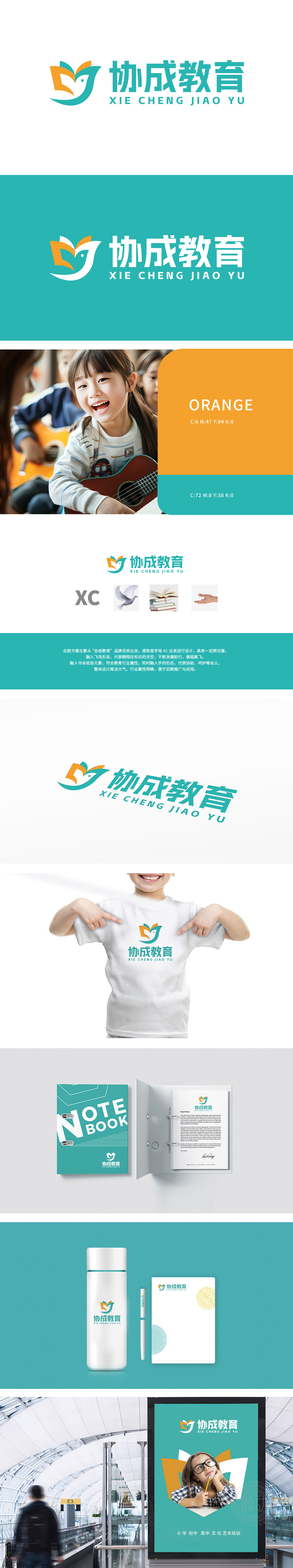
狮动设计以“XC”字母:提取自“协成教育”的首字母,简洁明了,具有高辨识度。飞鸟形态:代表知识的翱翔与不断前行,象征展翅高飞、追求卓越的精神。书本纸张元素:体现教育行业的属性,象征知识的积累与传递。色彩选择:绿色与橙色渐变:绿色象征希望与成长,橙色增添活力与创新,整体色调清新明亮,符合教育行业的积极向上特质。整体以精妙的创意平衡了张力与温度——抽象的飞鸟形态挣脱框架束缚,在知识的天空划出昂扬弧线;书本元素则以柔和的曲线舒展,如同翻开的知识之门,而掌心托举的弧度,更暗含对孩童的温柔守护。
Lion design uses the letter "XC": the first letter extracted from "Xiecheng Education", which is concise and clear, and has high recognition. Bird form: represents the soaring and continuous progress of knowledge, and symbolizes the spirit of flying high and pursuing Excellence. Book and paper elements: reflect the attributes of the education industry and symbolize the accumulation and transmission of knowledge. Color selection: green and orange gradient: green symbolizes hope and growth, orange adds vitality and innovation, and the overall tone is fresh and bright, which conforms to the positive characteristics of the education industry.


扫码或拨打添加客服微信


