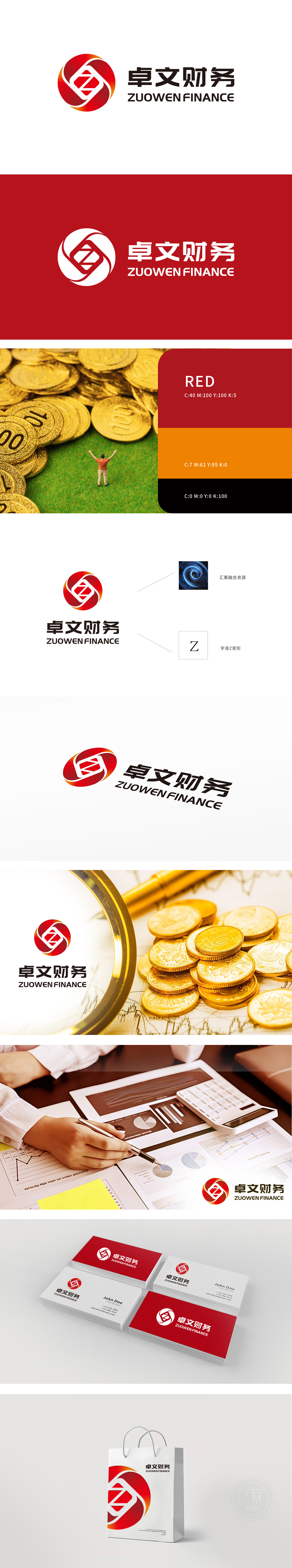
狮动设计以核心字母“Z”的变形设计,以锋利且流畅的线条穿透视觉空间,不仅强化品牌识别符号,更传递出金融领域所需的精准、锐利与不可撼动的专业力量。整体构图在沉稳中蕴含爆发感,恰似资金流转的稳健与市场机遇的瞬息万变,精准击中金融行业受众对“安全与创新并存”的深层需求。通过大胆的色彩运用与几何形态创新,塑造出卓文财务品牌标志的独特魅力——红色与橙色的渐变如火焰般升腾,象征财富增长与行业活力;
Lion design uses the deformation design of the core letter "Z" and penetrates the visual space with sharp and smooth lines, which not only strengthens the brand identification symbol, but also conveys the precise, sharp and unshakable professional strength needed in the financial field. The overall composition contains a sense of explosion in calmness, just like the stability of capital flow and the rapid change of market opportunities, which accurately hits the deep demand of the financial industry audience for "safety and innovation coexist". Through bold color application and geometric innovation.


扫码或拨打添加客服微信


