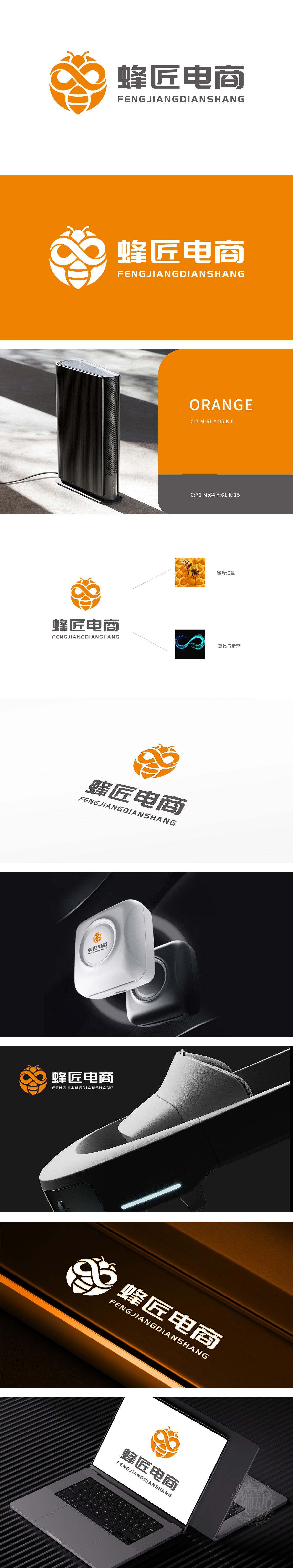
狮动设计巧妙融合蜜蜂造型与莫比乌斯环,形成极具辨识度的视觉符号。蜜蜂形象象征勤劳、协作与自然智慧,契合电商行业高效、联结的属性;莫比乌斯环的无限循环结构,则暗喻品牌在数字经济中持续创新、突破边界的发展愿景。橙色主色调活力跃动,与蜂巢的几何线条相呼应,整体设计在理性与灵动间达成平衡,既传递专业信赖感,又彰显开拓未来的生命力。
Lion design skillfully combines the bee shape with Mobius ring to form a highly recognizable visual symbol. The image of bee symbolizes hard work, cooperation and natural wisdom, which is in line with the efficient and connected attributes of e-commerce industry; The infinite circular structure of Mobius ring is a metaphor for the brand's development vision of continuous innovation and breakthrough in the digital economy. The main color of orange is vibrant and echoes the geometric lines of the honeycomb.


扫码或拨打添加客服微信


