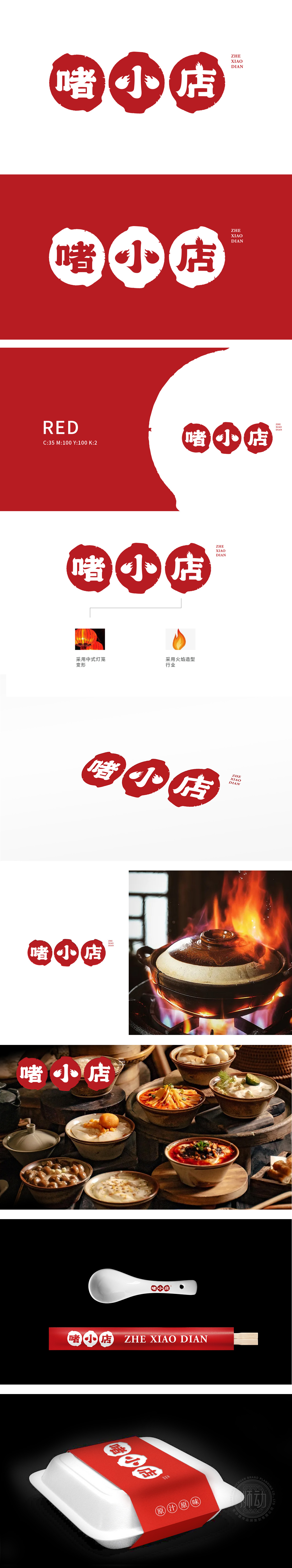
狮动设计基于灯笼轮廓的流线变形打破传统框架,张力迸发间传递出“热辣、鲜活、不灭”的品牌生命力。灯笼结构暗藏玄机:暖光晕染象征“烟火气与温度感”,精准呼应餐饮/零售等行业特性;“ZHE XIAO DIAN”以暗红隐于火焰后方,如余温袅袅,完成品牌识别的国际化闭环。整体以“中式灯笼变形”与“火焰造型行业”为核心元素,锻造出极具冲击力的视觉符号!
Lion design breaks the traditional framework based on the streamline deformation of lantern outline, and the brand vitality of "hot, lively and immortal" is conveyed between tension generate. There is a mystery in the structure of lanterns: warm halo dyeing symbolizes "fireworks and temperature sense", which accurately echoes the characteristics of catering/retail industries; "ZHE XIAO DIAN" hides behind the flame with dark red, such as lingering temperature, completing the international closed loop of brand recognition.


扫码或拨打添加客服微信


