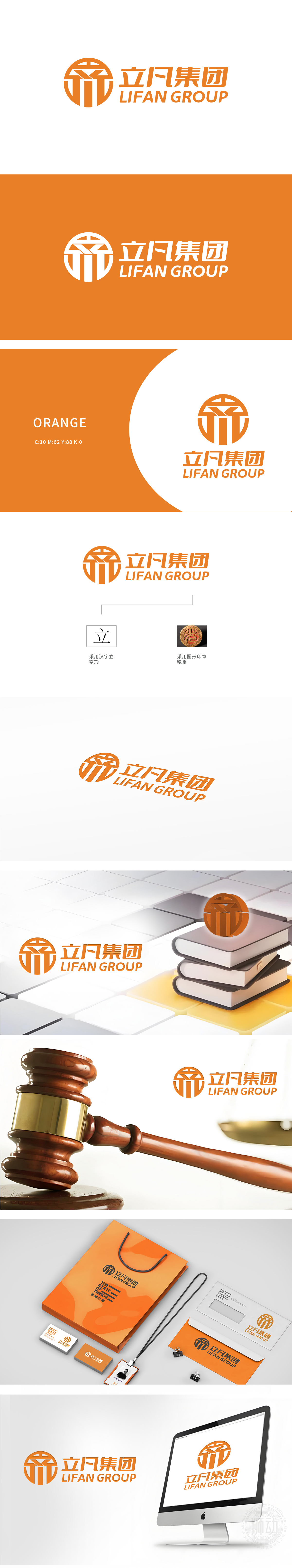
狮动设计以汉字“立”为基因,突破传统字形束缚,通过几何线条的重组,使其既保留汉字的结构筋骨,又迸发出现代设计的锐利感。垂直的挺拔线条如企业向上的发展之势,倾斜的笔画似突破常规的创新能力,整体造型稳而不僵、动而不乱,恰如立凡集团“立足根基,锐意进取”的品牌内核。圆形印章设计,汲取中国传统印章的庄重与权威感,印章的“封印”形态,更传递出品牌值得信赖的行业地位与承诺的重量。将汉字变形、印章元素与品牌精神紧密结合,展现设计的策略性与文化深度,契合企业LOGO的稳重与现代气质。
Lion Dance Design takes the Chinese character "Li" as its gene, which breaks through the shackles of traditional glyphs. Through the reorganization of geometric lines, it not only retains the structural bones of Chinese characters, but also reflects the sharpness of modern design. The vertical straight lines are like the upward development trend of enterprises, the inclined strokes seem to break through the conventional innovation ability, and the overall shape is stable but not rigid, moving but not chaotic, just like the brand core of Lifan Group's "based on the foundation and forge ahead". The design of the circular seal draws on the solemn and authoritative sense of the traditional seal in China, and the "seal" form of the seal conveys the brand's trustworthy industry position and commitment.


扫码或拨打添加客服微信


