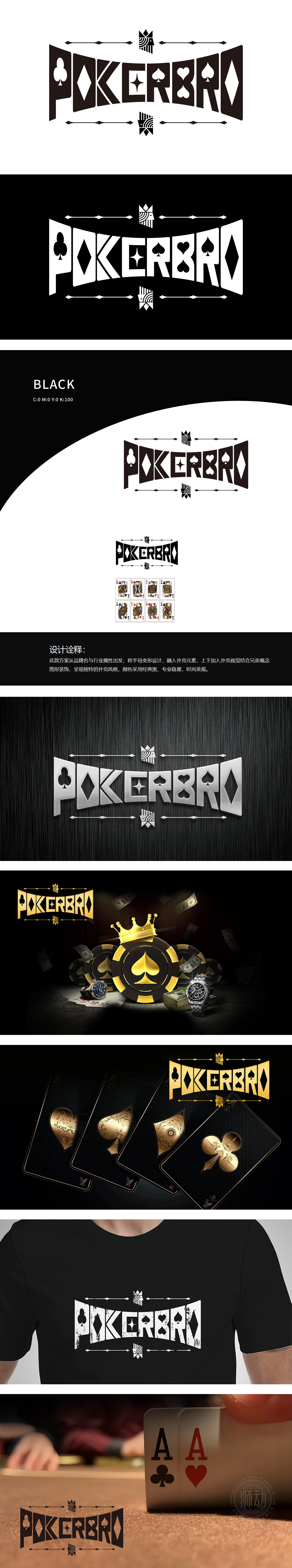
狮动设计以颠覆性思维将“POKERBRO”品牌内核撕裂重组——字母在变形中迸发力量,每一笔划都化作扑克牌面的锋利棱角,顶部与底部对称的兄弟图腾如火焰撕裂黑夜,经典黑的底色更是黑色利刃,切割出令人窒息的视觉边界。这不是简单的LOGO,而是用图形锻造的战争宣言,用设计点燃的行业革命!
Lion design tears and reorganizes the core of "POKERBRO" brand with subversive thinking-the power of generate in the deformation of letters, each stroke turns into a sharp corner of the playing card face, the fraternal totem with symmetrical top and bottom tears the night like a flame, and the classic black background is a black sharp blade, cutting out a suffocating visual boundary. This is not a simple LOGO, but a declaration of war forged by graphics and an industry revolution ignited by design!


扫码或拨打添加客服微信


