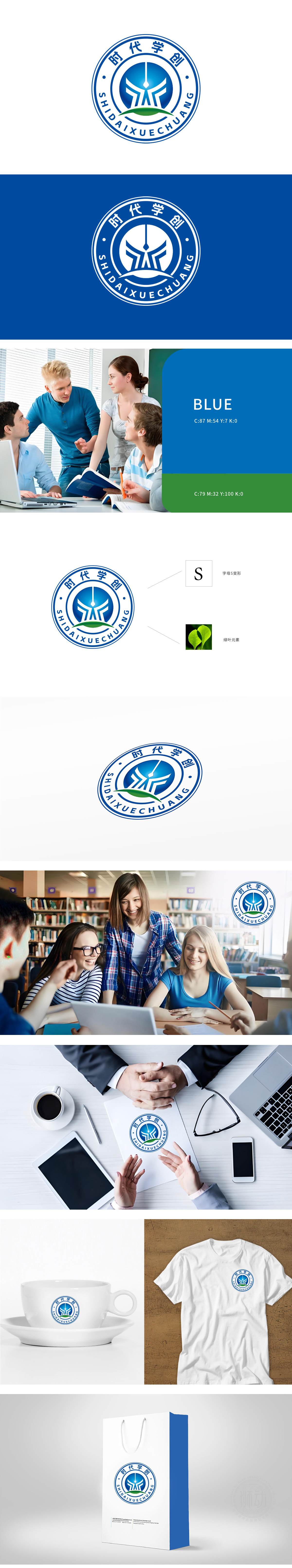
狮动设计将字母S被彻底重构:它如闪电劈开天际,又如思维脉络无限延展片并非点缀,而是教育生态的具象表达:边缘的锐利弧度象征突破传统框架的勇气,叶脉的透明渐变则隐喻知识如光合作用般滋养未来。它们与S变形图案的机械感形成激烈碰撞——科技与人文、理性与生命在此交融,这正是现代教育对“全人培养”的终极诠释。整体设计不再是静态符号,而是流动的思维、生长的力量、裂变的未来。
Lion design completely reconstructs the letter S: it splits the sky like lightning, and the infinite extension of thinking thread is not embellishment, but a concrete expression of educational ecology: the sharp curvature of the edge symbolizes the courage to break through the traditional framework, and the transparent gradual change of veins implies that knowledge nourishes the future like photosynthesis. They collide fiercely with the mechanical sense of S-shaped patterns-science and technology and humanities, reason and life blend here, which is the ultimate interpretation of "all-round cultivation" in modern education.


扫码或拨打添加客服微信


