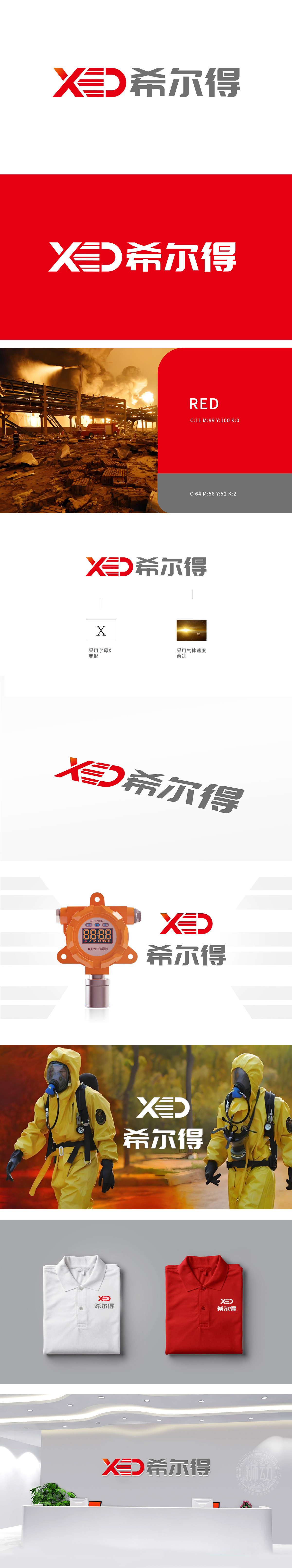
狮动设计采用字母“X”变形,象征未知与探索,传达科技感和创新精神。速度线条展示速度前进的视觉效果,动态画面感跃然纸上。"在星辰间疾驰,以X为钥开启未来——狮动为XED希尔得打造的视觉符号,"将速度与力量的极致美学注入品牌基因。"
Lion design uses the letter "X" to symbolize the unknown and exploration, and conveys the sense of science and technology and the spirit of innovation. The speed line shows the visual effect of speed advance, and the dynamic picture feels vividly on the paper. "Galloping among the stars, opening the future with X as the key-lion movement is a visual symbol created by XED Hill," injecting the ultimate aesthetics of speed and strength into the brand gene. "


扫码或拨打添加客服微信


