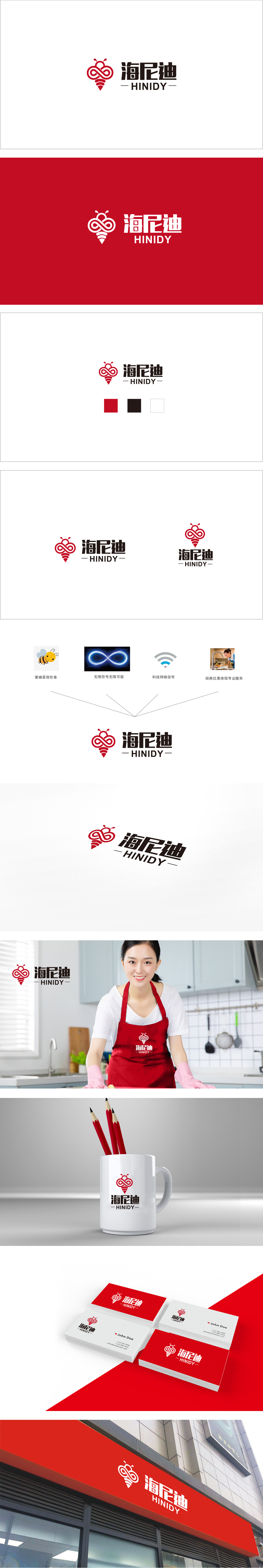
狮动设计把海尼迪的品牌属性做了“视觉翻译”:蜜蜂=家政服务的“勤劳、贴近生活”,无限符号=“无限可能”(暗示服务的延伸性或品牌的成长空间);网络信号=“科技支撑”;红黑体+场景=“专业可靠”(强化“值得信任”的质感)。整体将蜜蜂的可爱、无限的抽象、网络的科技,都被揉进了一个“和谐的形状”里,既保留了每个符号的辨识度,又让整体看起来“像一个完整的故事”,用图形当“翻译官”——把品牌的核心价值(家政、科技、专业、无限),转换成用户能“一眼读懂”的视觉语言。
Lion Design has made a "visual translation" of Heinidi's brand attributes: bee = "hardworking and close to life" of domestic service, and infinite symbol = "infinite possibility" (implying the extension of service or the growth space of brand); Network signal = "technical support"; Red and bold+scene = "professional and reliable" (strengthening the texture of "trustworthy"). As a whole, the loveliness of bees, infinite abstraction and network technology are all kneaded into a "harmonious shape", which not only retains the recognition of each symbol.


扫码或拨打添加客服微信


