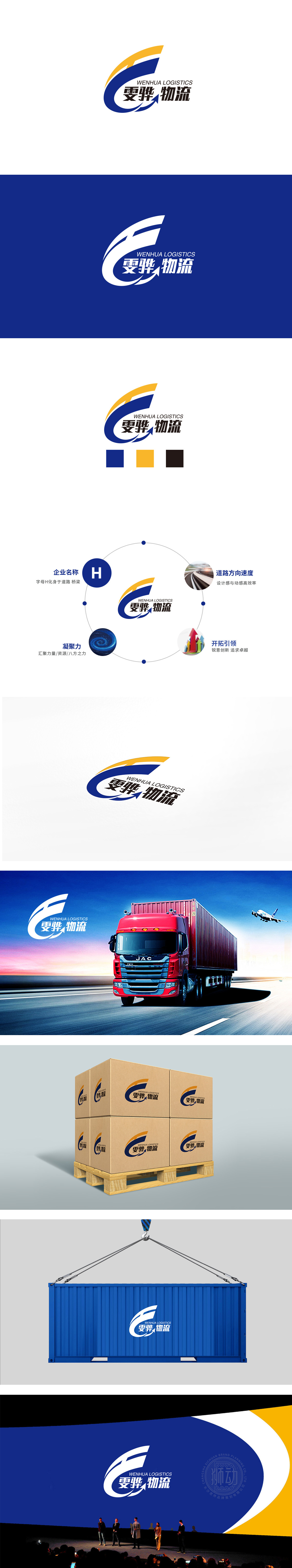
狮动设计采用「蓝色半包围曲线+黄色加速线条+箭头」的组合,通过抽象符号传递强行业联想:蓝色主曲线:形如「展开的翅膀」,既模拟了「物流运输中的包裹/容器」(承载性),又隐喻「企业的发展张力」,符合物流「传递价值」的核心功能。黄色加速线条+箭头,像「闪电轨迹」或「快速移动的光影」,直接象征速度与活力,暗示企业「高效运营」的优势。通过符号的强行业联想(箭头、流动线)、色彩的精准定位(蓝=可靠,黄=活力),传递「可靠、稳定、专业」的印象,符合客户对「物流安全送达」的核心需求。
Lion Design adopts the combination of "blue semi-enclosed curve+yellow accelerating line+arrow", and conveys strong industry association through abstract symbols. The blue main curve is shaped like "unfolded wings", which not only simulates "packages/containers in logistics transportation" (bearing capacity), but also metaphors "development tension of enterprises", which is in line with the core function of "delivering value" in logistics. The yellow accelerating line+arrow, like "lightning track" or "fast moving light and shadow", directly symbolizes speed and vitality, suggesting the advantages of "efficient operation" of enterprises.


扫码或拨打添加客服微信


