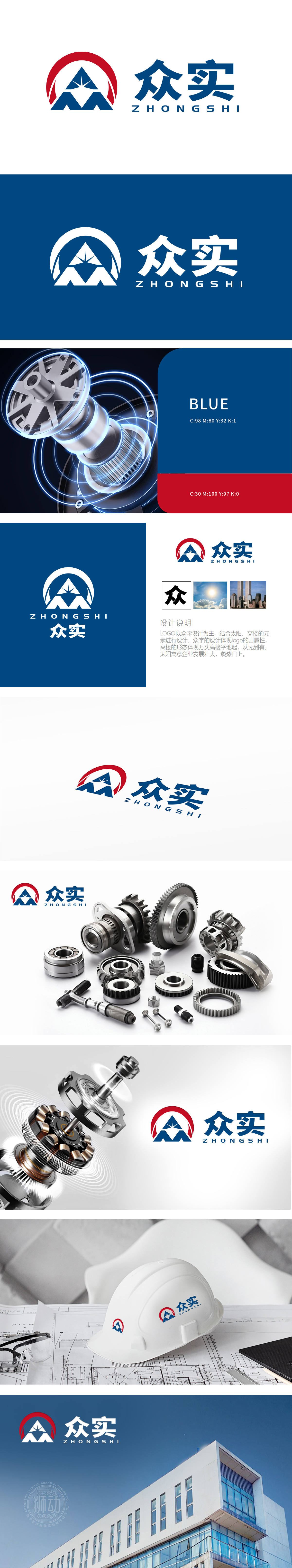
狮动设计以众”字为骨架,通过几何化的线条重构字形,使其呈现出现代机械的精密感与工业美学。“众”字的三人体结构被巧妙保留,隐喻团队协作、共创共赢的企业文化。传递出“众志成城”的品牌凝聚力。笔画间的棱角处理、模块化的组合方式,既保留了汉字文化的传承性,又赋予品牌坚实的建筑基石意象,象征企业“万丈高楼平地起”的稳健发展理念。而动态线条的设计则如光束迸发,象征品牌突破创新、积极向上的动能。整体设计以机械建筑”的稳重结构与“冲击力”的动态视觉为开篇,通过多元素的融合与创新,塑造出极具张力的品牌形象。
Lion design takes the word "Zhong" as the skeleton, and reconstructs the font through geometric lines, so that it presents the precision sense of modern machinery and industrial aesthetics. The three-body structure of the word "zhong" is cleverly preserved, which means teamwork and creating a win-win corporate culture. Convey the brand cohesion of "unity is strength". The angular treatment and modular combination between strokes not only retain the inheritance of Chinese character culture, but also endow the brand with a solid image of building cornerstone, symbolizing the steady development concept of enterprises.


扫码或拨打添加客服微信


