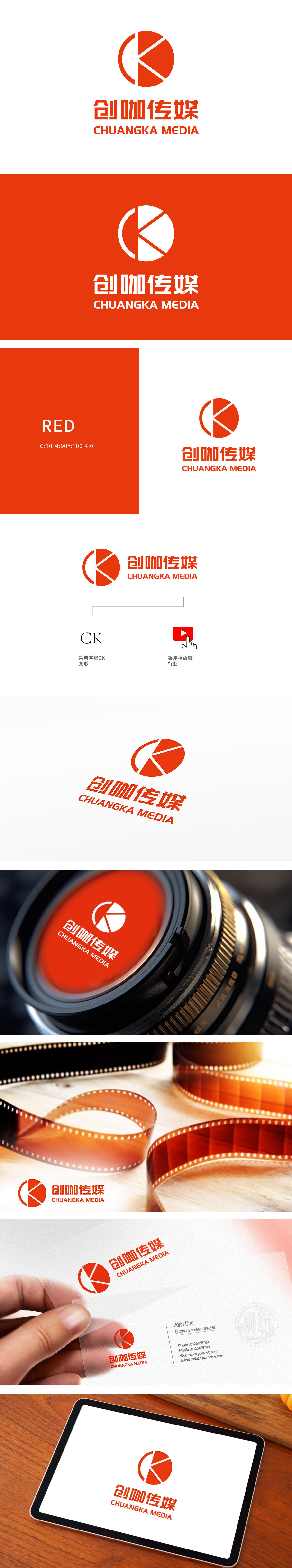
狮动设计将“CK”字母进行抽象化处理,线条的折角与倾斜姿态突破常规字体形态,形成独特的品牌符号。标识主体采用高饱和度橙色与红色,形成强烈的色彩对比。橙色区域(品牌名称、字母CK背景)传递活力与创新感,红色播放键符号则聚焦视觉重心,通过三角形箭头的方向性设计,营造“启动、传播”的动态势能,瞬间抓住观众注意力,动态符号驱动行动联想,使标识不仅是视觉符号,更成为品牌价值观的传递载体。
Lion design abstracts the letter "CK", and the bending angle and inclined posture of lines break through the conventional font form, forming a unique brand symbol. The main body of the logo adopts high saturation orange and red, forming a strong color contrast. The orange area (brand name, letter CK background) conveys vitality and innovation, while the red play key symbol focuses on the visual center of gravity. Through the directional design of the triangular arrow.


扫码或拨打添加客服微信


