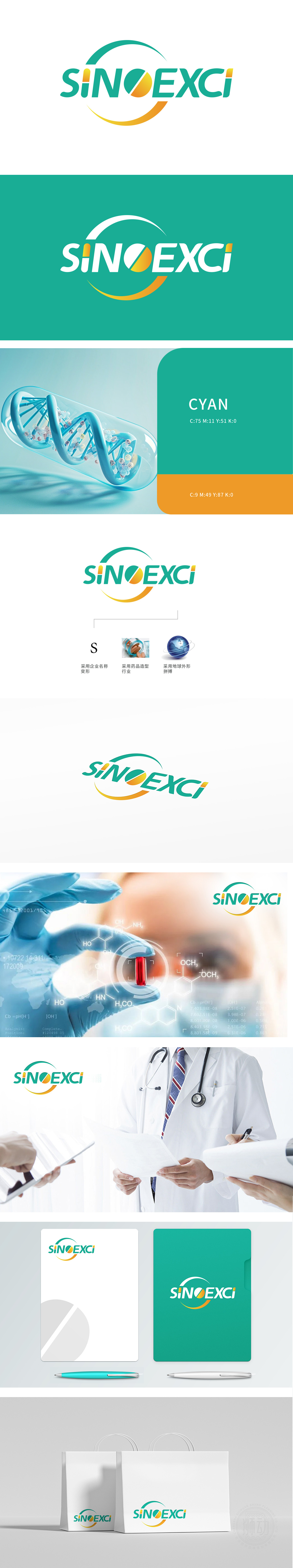
狮动设计巧妙地融入“S”不仅是公司名称“SINOEXCI”的首字母,还通过流畅的曲线设计,象征着公司业务的连贯性和创新性。中间的药片造型直观地传达了公司所属的医药行业,突显其专业性和可信,色彩搭配:绿色和橙色的渐变设计,既传达了健康、自然的医药行业属性,又增添了活力和现代感。深度融合医药行业特质与全球化视野,通过精准的符号语言,为您打造能够直击行业核心的视觉符号,展现品牌「以科技链接全球健康」的宏伟蓝图。
The clever integration of "S" into the lion design is not only the initials of the company name "SINOEXCI", but also symbolizes the continuity and innovation of the company's business through smooth curve design. The middle tablet shape intuitively conveys the pharmaceutical industry to which the company belongs, highlighting its professionalism and credibility.Color matching: the gradual design of green and orange not only conveys the healthy and natural attributes of the pharmaceutical industry, but also adds vitality and modernity.


扫码或拨打添加客服微信


