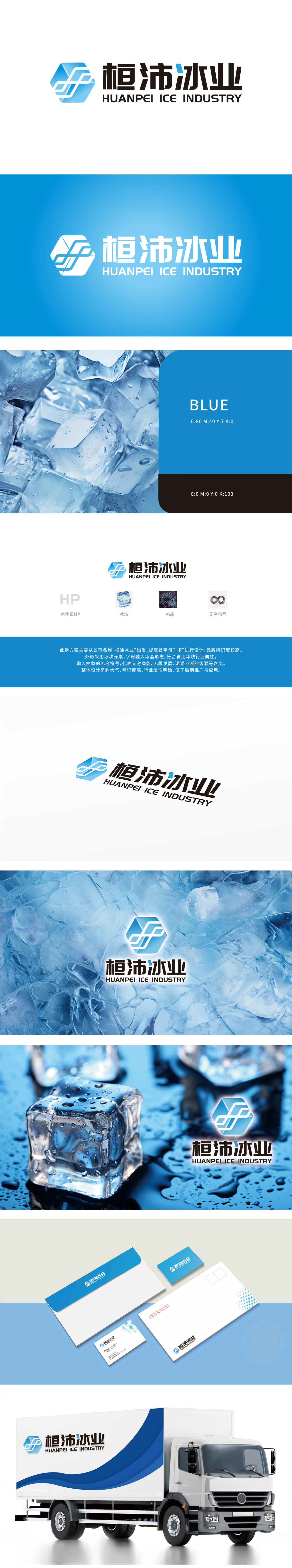
狮动设计以首字母“HP”,简洁明了,易于记忆。冰块元素:象征公司主营业务,直观展现行业属性,增强品牌辨识度。冰晶形态:字母与冰晶融合,体现专业性和独特性,视觉效果清新透明。无穷符号:融入抽象设计,寓意公司发展潜力无限、客源源源不断,传递积极向上的企业理念。冰块之形锻造品牌棱角,冰晶之态雕琢行业锐度,无穷符号如冷链延伸向无尽未来,冰锋破界,未来凝势——狮动设计让‘冷’能量沸腾!
Lion's design uses the initials "HP": it is derived from the initials of the company name "Huanpei Ice Industry", which is concise and easy to remember. Ice element: it symbolizes the company's main business, intuitively displays the industry attributes and enhances brand recognition. Ice crystal shape: the combination of letters and ice crystals reflects professionalism and uniqueness, and the visual effect is fresh and transparent. Infinite symbol: The integration of abstract design means that the company has unlimited development potential, a steady stream of customers and a positive corporate philosophy.


扫码或拨打添加客服微信


