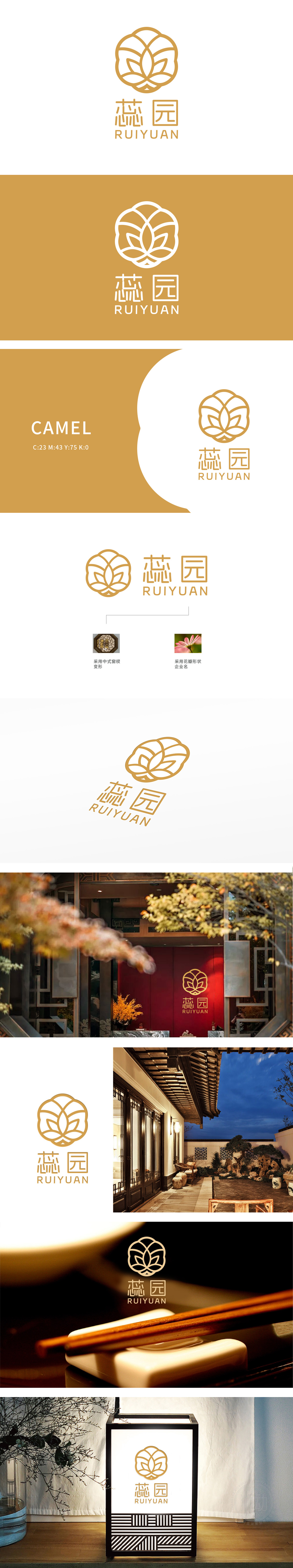
狮动设计以中式窗棂变形为骨,花瓣形态为魂,构建出极具韵律感的视觉符号:窗棂之韵:外环取传统建筑中“冰裂纹”窗棂的对称美学,线条交织如镂空花窗,暗合“园”之幽静意境,传递东方空间的层次与深邃。花芯之灵:内核以抽象花瓣层层环抱,似含苞待放的花蕊(呼应“蕊”字),金黄线条灵动舒展,既保留自然的柔美感,又通过几何化处理赋予现代简约气质。字体巧思:“蕊园”二字融合书法笔意与宋体结构,笔画粗细变化如花瓣脉络;让东方智慧,成为品牌的独特语言。
Lion design takes the deformation of Chinese window lattice as the bone and the petal shape as the soul, and constructs a visual symbol with a strong sense of rhythm: the rhyme of window lattice: the outer ring adopts the symmetrical aesthetics of the "ice crack" window lattice in traditional architecture, and the lines are intertwined like hollow flower windows, which coincides with the quiet artistic conception of "garden" and conveys the level and profundity of oriental space. The spirit of flower core: the core is surrounded by abstract petals layer by layer, like a budding flower (echoing the word "Rui"), and the golden lines are flexible and stretched.


扫码或拨打添加客服微信


