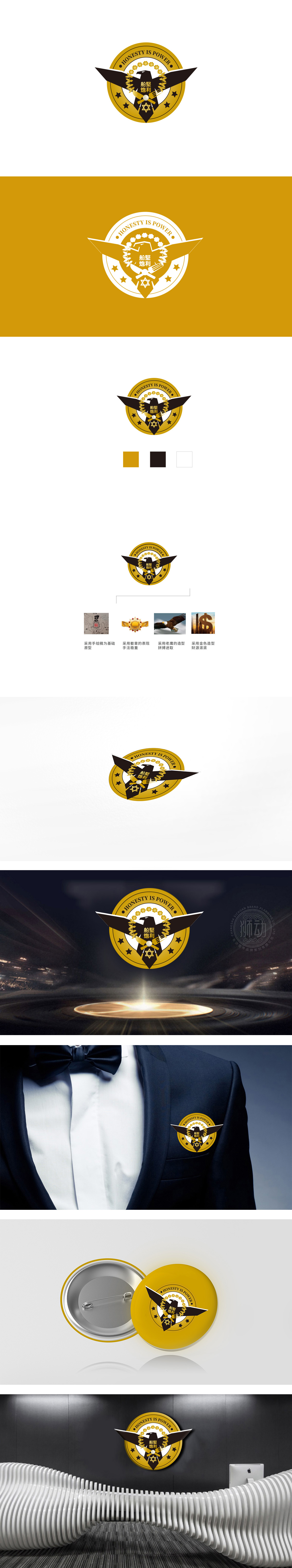
狮动设计把抽象诉求变成“可看见的语言”,整个标志的视觉元素像一套“精密的拼图”,每一块都在传递特定的信息:鹰的翅膀:展开的姿态充满动感,直接对应“拼搏进取”,用动物的本能属性(鹰=强者、拼搏)强化品牌的精神气质;金色圆形:金色是“财富”的经典符号,圆形则象征“圆满、包容”,既传递了“财源广进”的美好祝愿,又让标志显得稳重、大气;齿轮与五角星:齿轮代表“工业感、可靠性”,五角星则强化“经典、权威”,两者结合进一步夯实了“实力”的形象;整体既有“高端感”(金色),又有“力量感”(黑色),还有“记忆点”(红色),完美匹配“商业品牌”的视觉需求。
Lion design turns the abstract appeal into "visible language", and the visual elements of the whole logo are like a set of "precise puzzles", each piece is conveying a specific message: the eagle wings: the unfolded posture is full of movement, which directly corresponds to "struggling and enterprising", and strengthens the spiritual temperament of the brand with the instinctive attributes of animals (eagle = strong, struggling); Golden circle: gold is the classic symbol of "wealth", while the circle symbolizes "completeness and tolerance", which not only conveys the good wishes of "rich resources".


扫码或拨打添加客服微信


