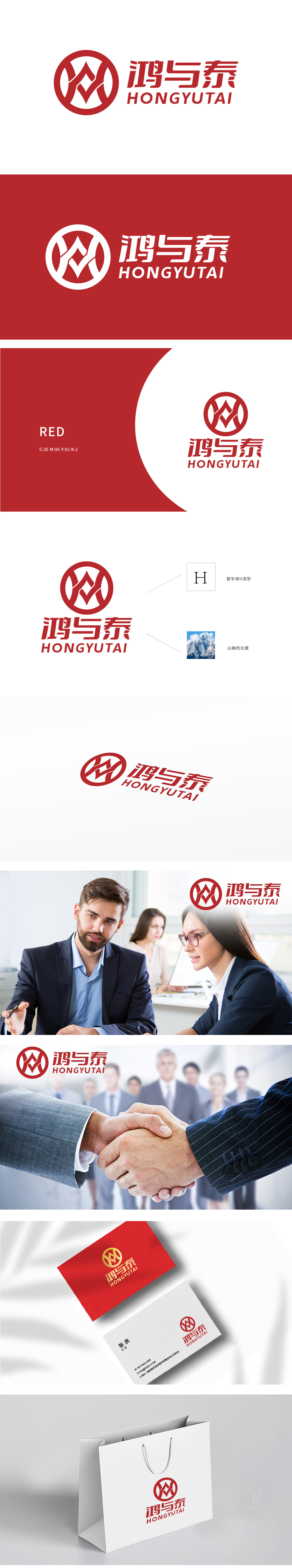
狮动设计以变形的字母“H”,象征着公司的品牌标识。山峰的元素:“H”内部的设计融入了山峰的形态,山峰象征着稳固、坚韧和高远,传达出公司追求卓越、稳步发展的理念。冲击力设计:红色的使用使得Logo显得醒目且具有强烈的视觉冲击力,易于识别和记忆。山峰的稳固形象也寓意公司在商务咨询领域中的可靠性和专业性。标识中的每一处设计细节都在无声传递专业咨询机构的三大核心价值:战略破局的锐度、稳固信赖的厚度、驱动变革的热度。
Lion design with the deformed letter "H" symbolizes the company's brand identity. The elements of the mountain peak: the internal design of "H" is integrated into the shape of the mountain peak, which symbolizes stability, tenacity and lofty, and conveys the company's concept of pursuing Excellence and steady development. Impact design: The use of red makes the Logo stand out and has a strong visual impact, which is easy to identify and remember. The stable image of the mountain peak also implies the reliability and professionalism of the company in the field of business consulting.


扫码或拨打添加客服微信


