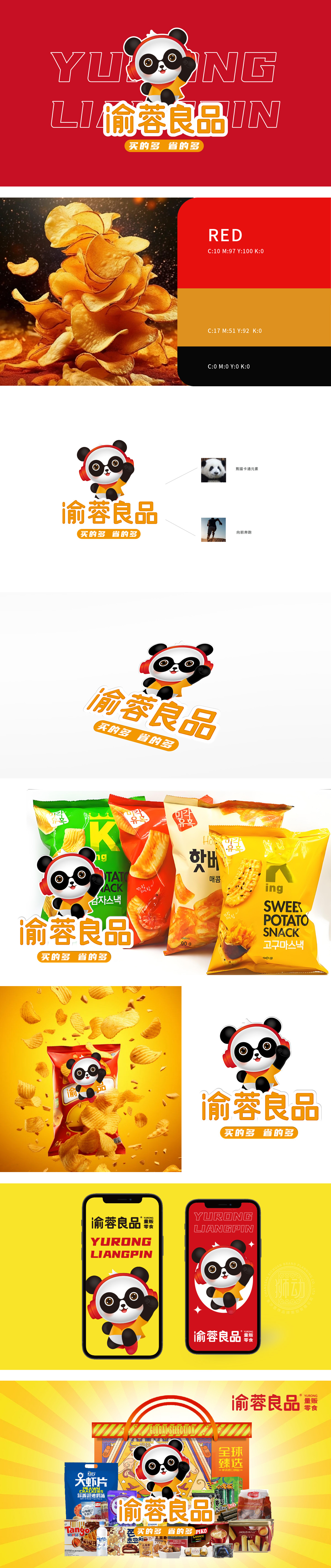
狮动设计以中国国宝为原型,自带国民好感度与传播基因,打破地域限制,让品牌快速渗透大众心智;圆融的线条与灵动的表情(弯眉笑眼、腮红点缀),消解商业品牌的距离感,拉近与消费者的情感连接。向前奔跑的隐喻:熊猫挥臂姿态与右侧“奔跑者”图标形成视觉呼应,既传递品牌积极向上的发展愿景,也暗喻“为消费者省时省心、领跑性价比”的服务理念,用图形语言强化“高效、实惠”的核心卖点。色彩战略:橙色主色调温暖醒目,激发购买欲;红色耳机作为点睛亮色,增强视觉记忆点;“熊猫挥袖展欢颜,橙光一点入心间;步履不停追效益,万家良品省为先。”
Lion design is based on China's national treasure, with national goodwill and communication genes, breaking geographical restrictions and allowing brands to quickly penetrate the public mind; Round lines and smart expressions (curved eyebrows, smiling eyes and blushing embellishment) dispel the sense of distance of commercial brands and draw closer the emotional connection with consumers. Metaphor of running forward: the panda's waving posture forms a visual echo with the icon of "runner" on the right, which not only conveys the positive development vision of the brand, but also implies the service concept of "saving time and worry for consumers and leading the cost performance", and strengthens the core selling point of "high efficiency and affordability" with graphic language. Color strategy: the main color of orange is warm and eye-catching, which stimulates the desire to buy.


扫码或拨打添加客服微信


