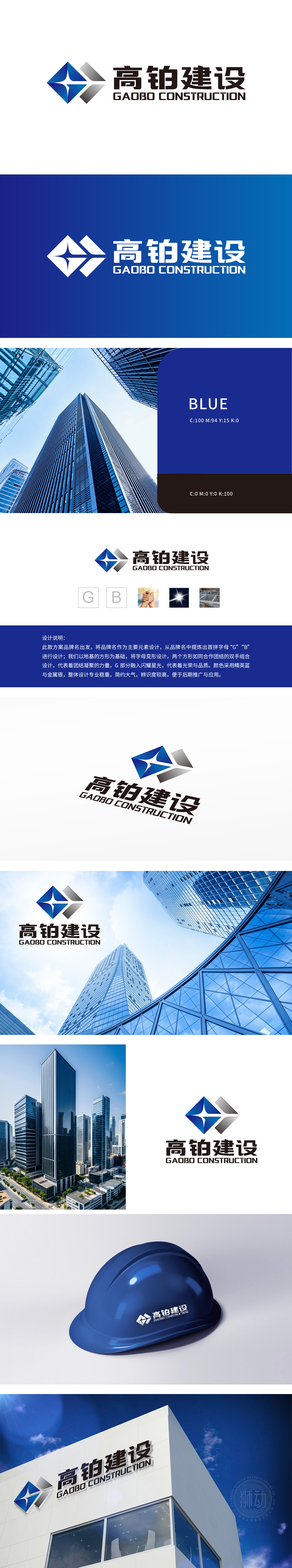
狮动设计首字母“G”“B”为设计原点,通过几何化处理将抽象字母转化为具象建筑语言。两个方形结构不仅是字母的变形,更象征建筑地基的稳固形态,直观传递建筑行业“根基扎实”的核心价值。这种从品牌名称到视觉符号的转化,体现了设计团队对品牌基因的深度挖掘与精准表达。两个方形以交错、嵌套的方式组合,形成类似“紧握双手”的视觉意象。这一设计突破传统建筑logo的冰冷感,注入“合作、团结”的人文精神,暗示企业在项目中的协同能力与凝聚力。这种“收与放”的构图策略,既传递建筑结构的稳固,又隐喻企业发展的开放性,冲击力源自动态与静态的冲突美。
The initial letter "G" and "B" of Lion Motion design is the design origin, and the abstract letters are transformed into concrete architectural language through geometric processing. The two square structures are not only the deformation of letters, but also symbolize the solid form of building foundation, and intuitively convey the core value of "solid foundation" in the construction industry. This transformation from brand name to visual symbol reflects the deep excavation and accurate expression of brand genes by the design team. The two squares are combined in a staggered and nested way to form a visual image similar to "clasping hands".


扫码或拨打添加客服微信


