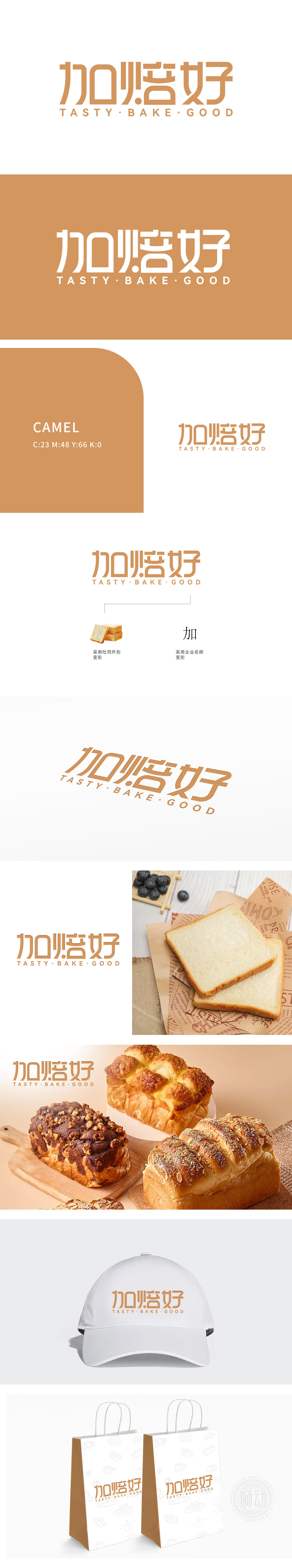
狮动设计基于主体为“加焙好”三个大字,字体设计圆润且具有亲和力,下方辅以英文“TASTY · BAKE · GOOD”,传达美味烘焙的品牌理念。左侧采用吐司外形的变形设计,直观展现烘焙主题;右侧采用企业名称“加”的变形,巧妙融合品牌名称。吐司外形与品牌名称的结合,既直观又富有创意,易于记忆。采用温暖的橙色,传递出烘焙食品的温馨与美味感。整体大胆提炼“吐司外形”,将其轮廓转化为品牌专属的视觉符号——圆润的弧线如同面团发酵时的自然膨胀,橙色主色则如蜂蜜般流淌出温暖与甜美的联想。
Lion design is based on the three Chinese characters "Bake well", and the font design is round and friendly, supplemented by English "Tasty Bake Good" to convey the brand concept of delicious baking. The left side adopts the deformation design of toast shape, which intuitively shows the baking theme; The right side adopts the deformation of "plus" of the enterprise name, and skillfully integrates the brand name. The combination of toast shape and brand name is intuitive, creative and easy to remember. Adopt warm orange to convey the warmth and delicacy of baked goods.The overall "toast shape" is boldly refined, and its outline is transformed into a brand-specific visual symbol-the rounded arc is like the natural expansion of dough during fermentation.


扫码或拨打添加客服微信


