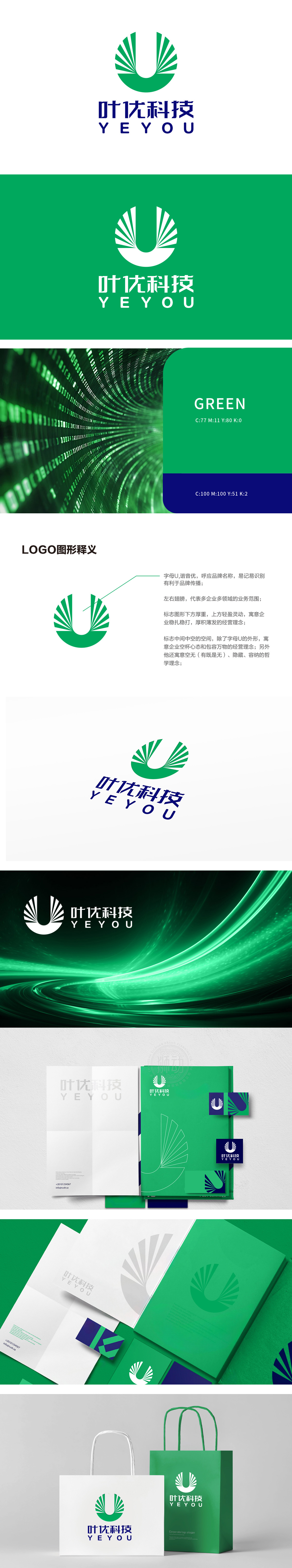
狮动设计由字母U,谐音“优”,呼应品牌名称,易于记忆和识别,有利于品牌传播。左右翅膀元素:象征多企业多领域的业务范围,展现公司的多元性和广泛性。上下结构对比:下方厚重,上方轻盈灵动,寓意企业稳扎稳打、厚积薄发的经营理念。中间中空空间:,还寓意企业保持空杯心态和包容万物的经营理念,同时蕴含“空无(有既是无)、隐藏、容纳”的哲学理念。
Lion design uses the letter U, which is homophonic "excellent", echoes the brand name, is easy to remember and identify, and is conducive to brand communication. Left and right wing elements: symbolize the business scope of many enterprises and fields, and show the diversity and extensiveness of the company. Comparison between the upper and lower structures: the lower part is heavy, and the upper part is light and agile.


扫码或拨打添加客服微信


