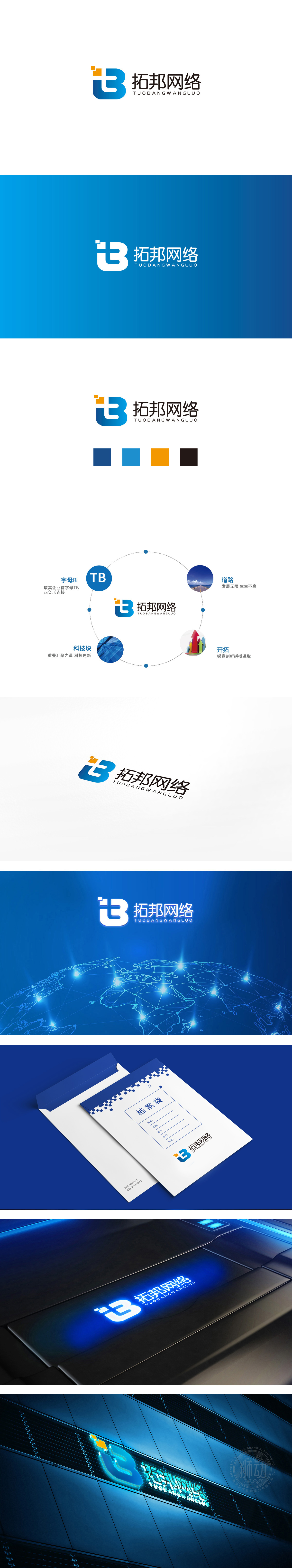
狮动设计将以企业首字母“T”+“B”为核心,通过负形连接与几何简化,形成极具辨识度的符号,形成“连接、融合”的视觉感受(契合“网络公司”的核心属性——连接人与信息、企业与客户)。主色为深海蓝(象征科技的稳重与专业),橙色小方块(传递创新与活力)。整体风格统一以字母为根、以概念为枝、以视觉为叶”的系统性表达,完美契合科技企业的““科技、开拓、可持续””核心价值观。
Lion Design will take the initials "T"+"B" as the core, and form a highly recognizable symbol through negative connection and geometric simplification, forming a visual feeling of "connection and integration" (which fits the core attributes of "network company"-connecting people and information, enterprises and customers). The main color is deep blue (symbolizing the steadiness and professionalism of science and technology) and small orange squares .


扫码或拨打添加客服微信


