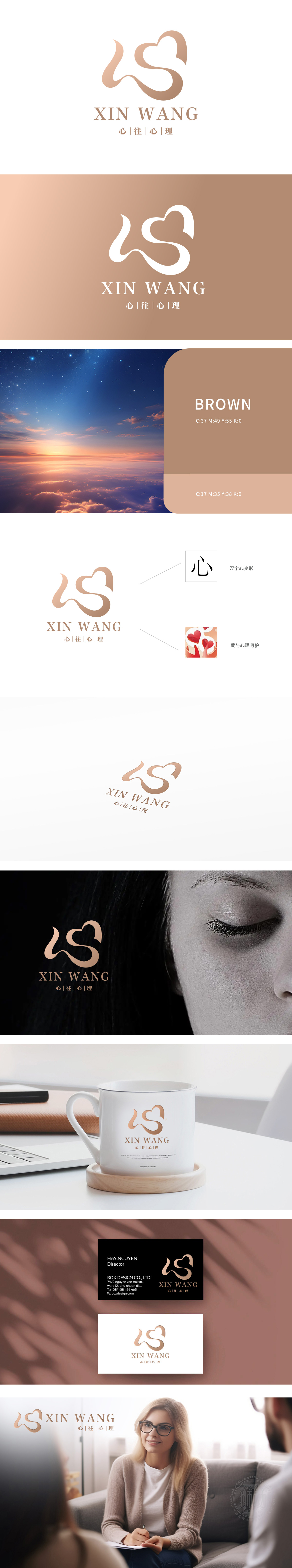
狮动设计由两个心形交织而成,巧妙地变形为汉字“心”,象征着爱与心理的双重含义。这种设计不仅美观,还深刻传达了品牌的核心理念——关注内心、传递爱意。柔和的棕色调:采用柔和的棕色调,给人以温暖、舒适的感觉,易于引起客户的共鸣,适合心理关怀品牌。以‘心’为魂,以爱为翼,以极具感染力的视觉语言,传递出温暖与关怀的双重力量,直击心灵深处!”
Lion design is interwoven with two hearts, which is skillfully transformed into the Chinese character "heart", symbolizing the double meanings of love and psychology. This design is not only beautiful, but also profoundly conveys the core concept of the brand-paying attention to the heart and conveying love. Soft earthy tones: Soft earthy tones gives people a warm and comfortable feeling, which is easy to resonate with customers and is suitable for psychological care brands.


扫码或拨打添加客服微信


