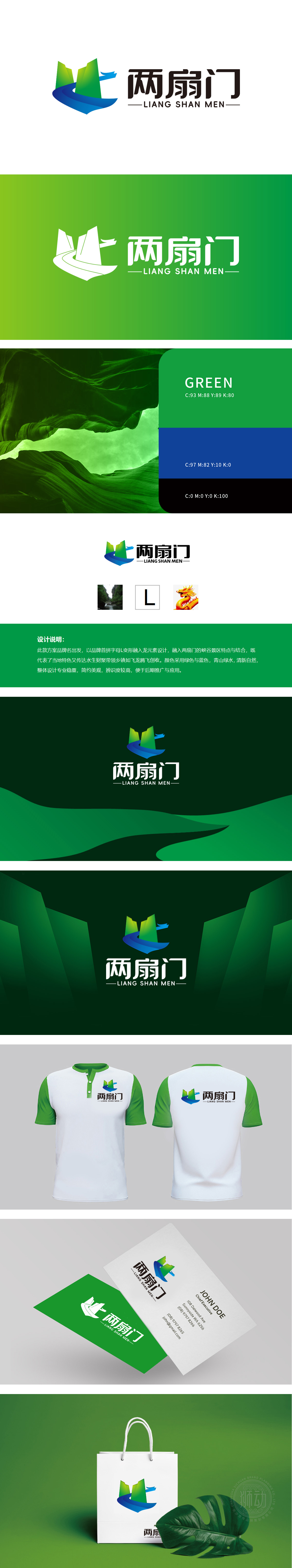
狮动设计的“两扇门”logo,以极具冲击力的视觉语言重构旅游服务品牌标识。核心元素“L”字母化身腾飞巨龙,龙身盘踞峡谷之间,将“绿水青山”的自然基因与“飞龙腾跃”的文化图腾深度融合。峡谷景观的纵深感象征旅游服务的深度探索,龙元素的灵动姿态传递品牌带领游客“破局新生”的价值承诺。绿色与蓝色的渐变配色,不仅呼应生态旅游的清新基调,更暗喻“水生财聚”的吉祥寓意,又赋予品牌厚重的文化底蕴,满足游客对“景观+故事”的双重期待。
The "Two Doors" logo designed by Lion Motion reconstructs the brand identity of tourism service with a powerful visual language. The letter "L", the core element, incarnates the soaring dragon, which is entrenched between canyons, deeply integrating the natural genes of "green water and green mountains" with the cultural totem of "flying dragons prancing". The depth of the canyon landscape symbolizes the in-depth exploration of tourism services, and the smart posture of the dragon element conveys the value commitment of the brand to lead tourists to "break the game".


扫码或拨打添加客服微信


