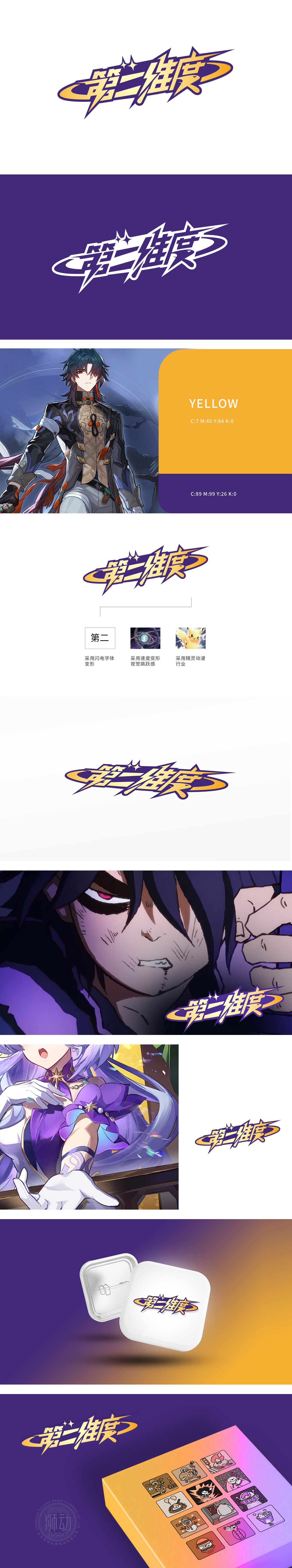
狮动设计采用“第二维度”中文字体,结合闪电与速度轨迹的动态变形:笔画融入闪电元素,线条锐利且富有张力,传递出科技感与突破性。金色与紫色的撞色搭配,强化视觉冲击力,暗示品牌在行业中的独特定位。弧形轨迹线模拟速度流动,打破传统静态Logo的局限,赋予品牌“持续进化”的视觉隐喻,符合“第二维度”的创新理念。极简几何切割字体,配合锐利闪电纹路,强化“速度”与“力量”的品牌基因,营造“无限可能”的未来感。
Lion design adopts the Chinese font of "second dimension", which combines the dynamic deformation of lightning and speed trajectory: the strokes are integrated with lightning elements, and the lines are sharp and full of tension, conveying a sense of science and technology and breakthrough. The contrast between gold and purple enhances the visual impact and implies the unique positioning of the brand in the industry. Arc trajectory simulates speed flow, breaks the limitation of traditional static Logo.


扫码或拨打添加客服微信


