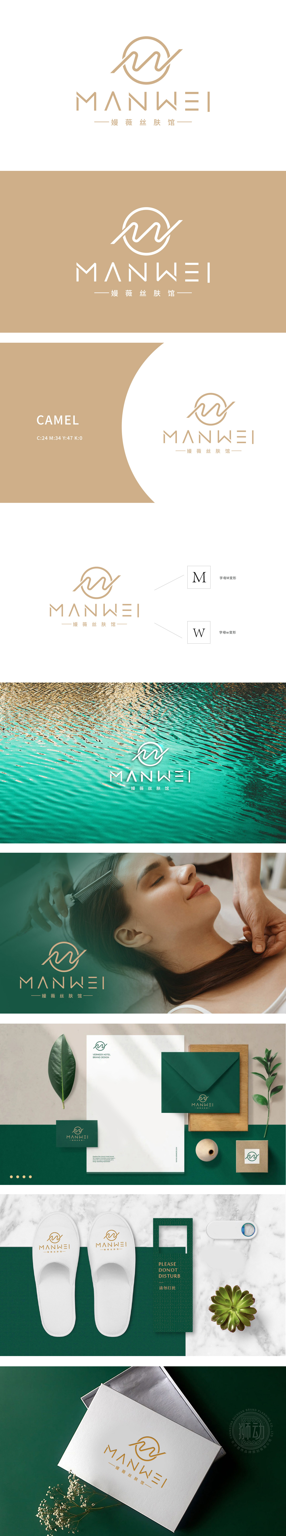
狮动设计由字母“M”和“W”变形而来,体现了品牌名称“MANWEI”的元素。融入了流畅的曲线,象征着肌肤的柔滑与健康,传达出护肤品牌的温和与专业特性。M的变形设计巧妙地融入了波浪线条,象征着肌肤的自然纹理和流畅线条,增强了品牌的亲和力和专业感。,整体设计采用简约风格,线条流畅,色彩以暖色调为主,传达出温馨、专业的感觉。潮流配色,不仅准确传达了主题,还具备高度的辨识度和艺术美感。
Lion design is transformed from the letters "M" and "W", which embodies the elements of the brand name "MANWEI". Blended with a smooth curve, it symbolizes the smoothness and health of the skin and conveys the gentleness and professional characteristics of the skin care brand. M's deformation design skillfully incorporates wavy lines, symbolizing the natural texture and smooth lines of the skin, and enhancing the brand's affinity and professionalism. The overall design adopts a simple style with smooth lines and warm colors, conveying a warm and professional feeling.


扫码或拨打添加客服微信


