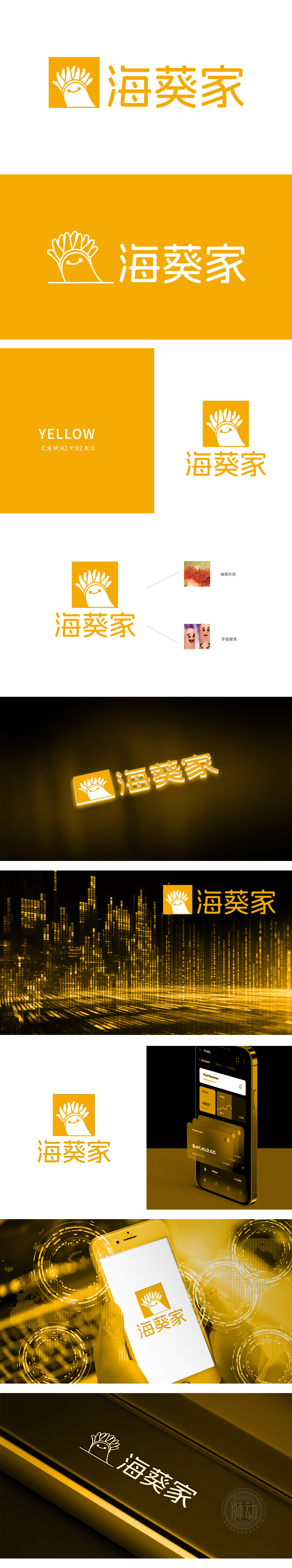
狮动设计融入一个黄色背景的方形图案,内含一个类似海葵的图形,图形顶部有放射状的触手,底部是一个笑脸,整体设计简洁且富有亲和力。Logo的底部笑脸设计灵感来源于手指上的微笑图案,传达了友好和温暖的感觉。潮流配色、扁平风格,创造出既有深度又有广度的作品,帮助客户快速理解品牌特色。
Lion Movement team conducted in-depth research on the industry trends and brand concepts, with vibrant orange as the main color, created an embarrassing cartoon bear image, and held a spoon to convey the pleasure of dining. Innovative use of "auspicious | food | bear" separate design, with pinyin to strengthen recognition. Simple and bright visual language fits the light food track accurately, and customers are full of praise for the design ability of Lion .


扫码或拨打添加客服微信


