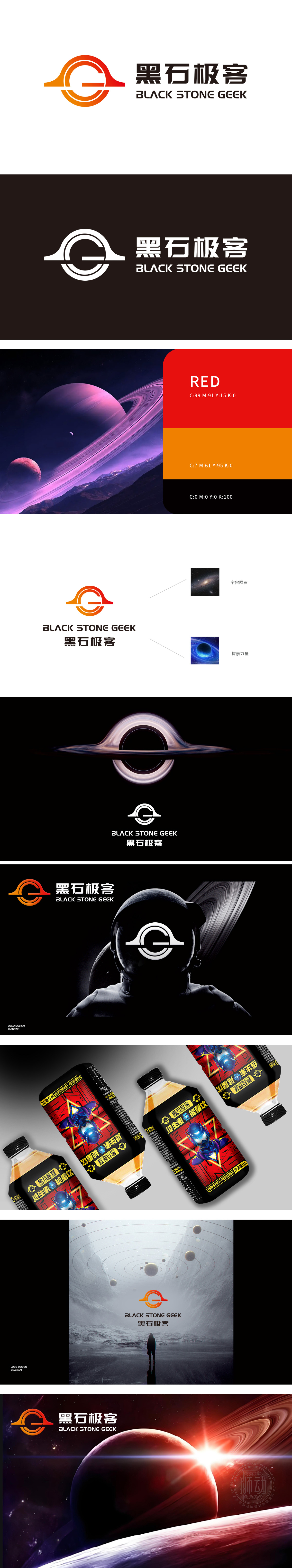
狮动设计以品牌名“黑”为灵感,融入“宇宙陨石”的神秘感——流畅的环形轮廓如陨石穿越大气层的轨迹,渐变橙红与深邃黑色碰撞,既像饮料液体的动感漩涡,又暗喻“探索能量”的品牌内核(呼应黑洞视觉符号)。极简字母“G”:嵌入环形中的“G”(Geek首字母)打破对称感,如同陨石撞击后迸发的能量节点,让logo在同类饮料品牌中极具辨识度,一眼就能记住“这杯有态度的饮料”。用宇宙级创意定义饮料新美学,让你的饮料,成为消费者心中“值得探索的宇宙”!
Inspired by the brand name "Black", Lion Motion Design incorporates the mystery of "Cosmic Meteorite"-the smooth circular outline is like the trajectory of the meteorite passing through the atmosphere, and the gradual orange-red collides with deep black, which is not only like the dynamic whirlpool of beverage liquid, but also a metaphor for the brand core of "exploring energy" (echoing the visual symbol of black hole). Minimalist letter "G": The "G" (geek initials) embedded in the ring breaks the sense of symmetry, just like the energy node of generate after the meteorite impact.


扫码或拨打添加客服微信


